
Download the full Rebel Hold Utopia Panel Creation eBook here.
To read the full Time Thief Comic, click here.
--
Jean-Marc, what were some of your favorite illustrations? From their ideation to final render, can you take us through their creation process?
Arguably everything starts with the script Chris and Banks wrote, describing each scene, including mood, characters' feelings, dialogue, numbers of images, etc … it’s already a tremendous amount of material for reflection.
From references' inspiration to composition, sequential flow or 3D exploration, the ideation process was very different for the 3 sequences … I would like to give a few examples.
For the EDO JAPAN first image, I was inspired by UKIYO-e, Japanese woodcut from the 19th, sort precursor of manga (by the way, if you have the opportunity to, don’t miss the Hokusai Museum in Tokyo, one of the masters of this art):

For the second I wanted to set up a scene with some traditional Japanese interior elements like the earthen floor, entrance still, picture recess, etc.… and to frame it from a seating position, because this kind of space is designed for people who are seated on the floor. So, I modeled some extra elements to modify the original building from the kit:


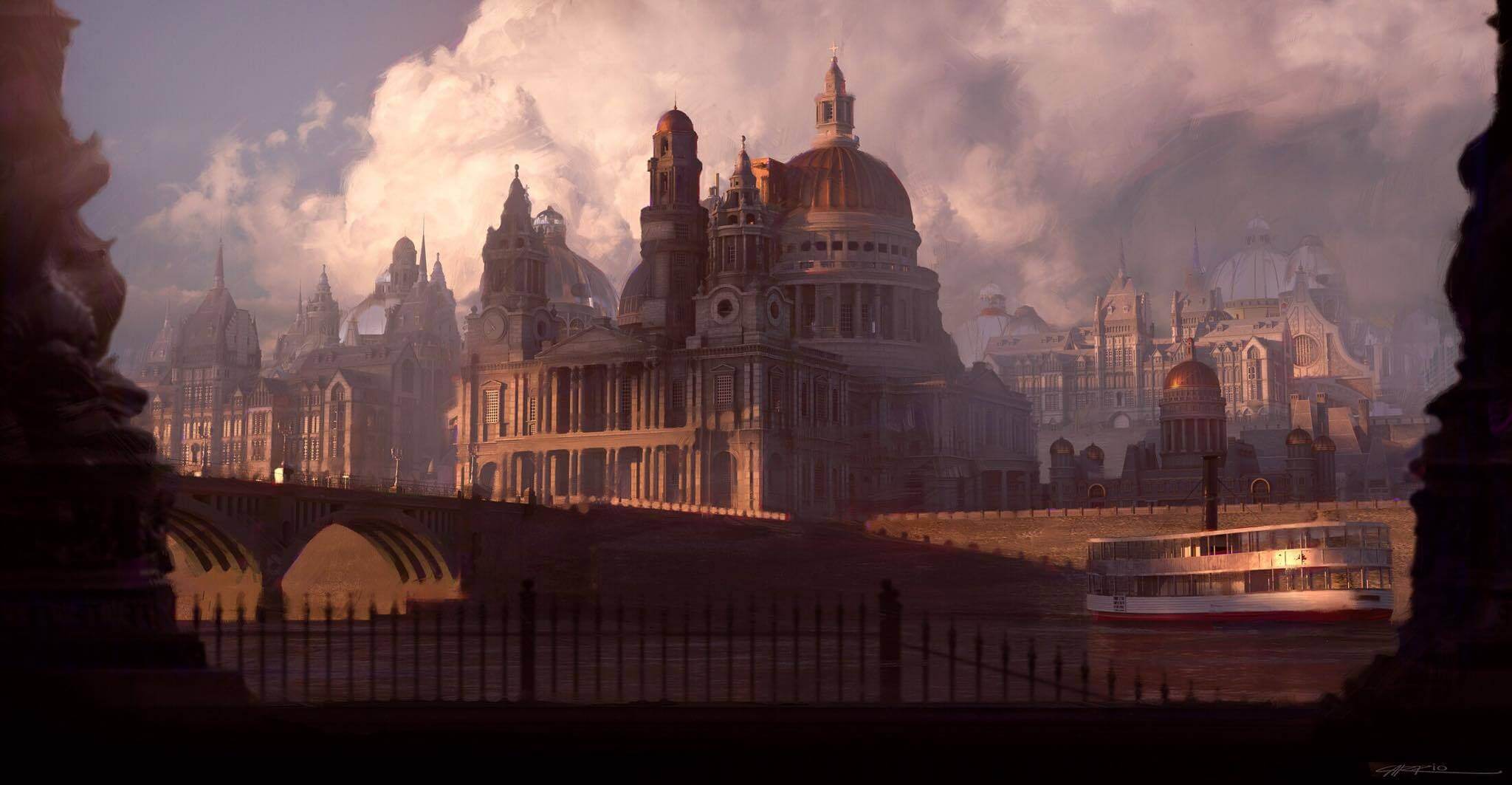
In a comic book, you must consider each image as a part of a narrative sequence. In the GOTHIC part, the three images work in symmetry: in the first image, where the portal is opening, there is a dynamic perspective that leads the eyes and the character into the “page”, the second image is “static”, and the third one is oriented in the opposite direction of the first one as the character is running out of the scene. Here, the choice of the architectural elements should fit with this idea, which is reinforced by the use of color, with the blue of the portal as an opening and an ending of the sequence:


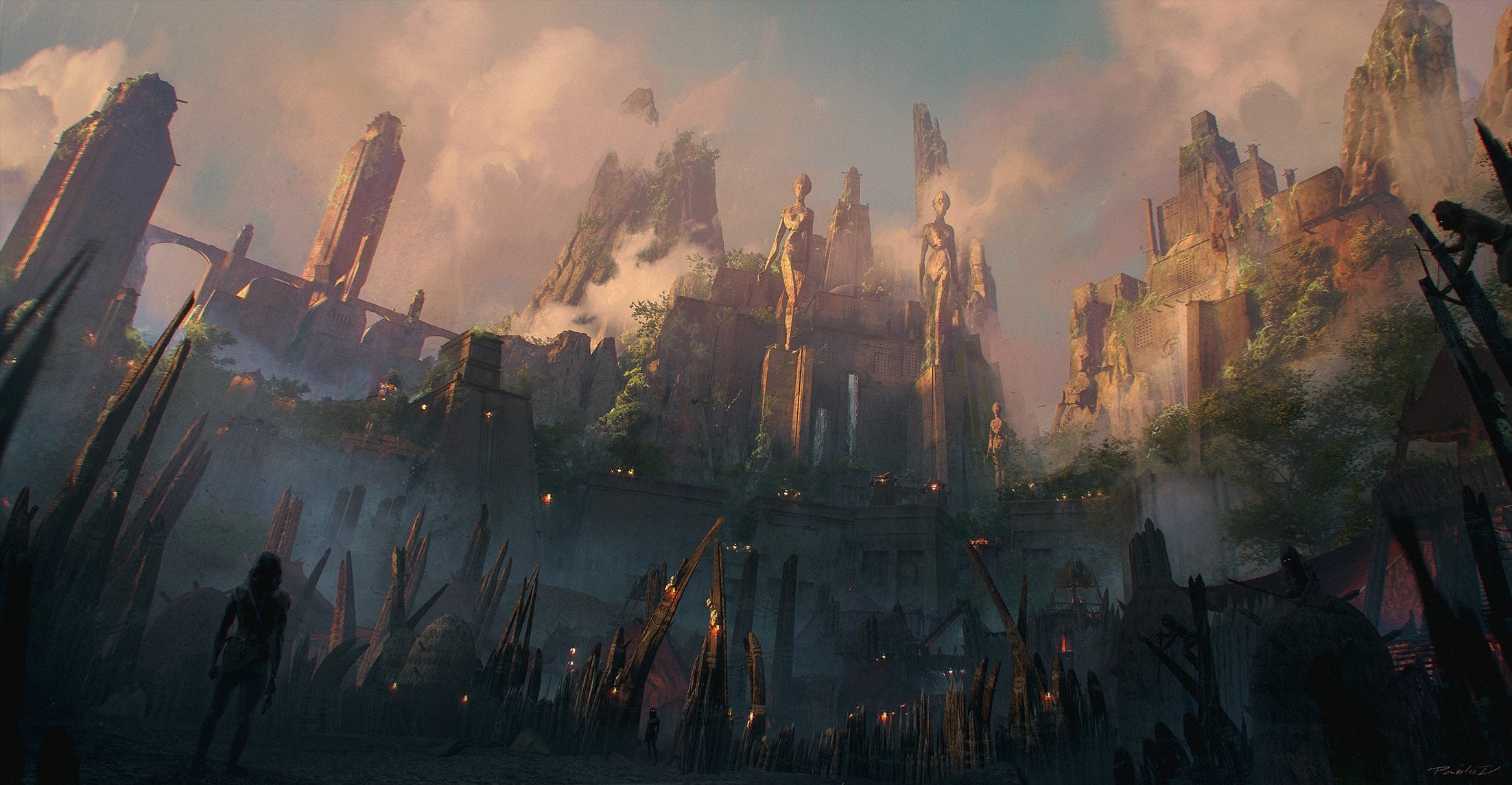
Sometimes you have clear ideas and sometimes you need more exploration, manipulation and this is what 3D, especially with these amazing kits, allows you to do. Once you have modeled or setup enough elements you can wander around in the same way a photograph would do and eventually have some nice surprises. In a way, this is the approach I had for the UTOPIA sequence. But even when I try to tackle the ideation phase in 3D, I always do thumbnail hand sketches at the same time, even very rough ones, to help to block shapes at the right scale and to adjust composition.

First I identified 3 entities: the Waranai Fortress, the Rebel Hold, and the city.
In 3dsMax, I designed first the Waranai Fortress building using some basic symmetry on one the kit model.
To create the cityscape, I added a few variations based on the kit and used ForestPro to scatter/populate the buildings, following a concentric organization around the fortress.

Finally, among this urban jungle, I chose one of the most “recognizable” building of the series as the one where the rebels would be settled. To give some dynamics, sense of scale and organization of the city area, some elevated highways were added alongside the buildings.
After a few tries which weren’t convincing, I ended up with 3 different POV: one low angle shot, one close up, and finally one large view where is revealed the silhouette of the fortress dominating the city.

Let's take a look deeper at the second panel for the UTOPIA series...
The process is almost the same for all the images. The environment is done in 3dsmax, render with V-ray, the characters are drawn in Clip Studio Paint as the text balloon frames and the whole is mixed in photoshop.
To create a kind of toon shader look I did 3 different renders.
One with very basic materials with a simple diffuse color (something neutral as I wanted to set up the color mood in photoshop):

One with a black and white ramp to create a cell shadow effect (with the latest V-ray version you now have a Vraytoon mat):

One with white material and with the Vraytoon effect activated to create art lines. I did render fewer versions of this one with different lines width so I can adjust them depending on the depth of the image:

I also rendered a bunch of passes: of Z-depth to make the city disappear in the fog but also to merge different width line passes, Normal to enhance some light effect and Color or Matte for selections.
I combined all those renders in photoshop, trying to keep layers separated between flat color, shadows, and art lines. I draw some extra lines to add cracks, details, and smoke and make it less “CAD-looking”:

I imagined that, as a result of everlasting war, the city is deserted by its inhabitants, plunged in a deep atmosphere of dust, smoke, and pollution which could give a distinctive color mood to this scene (the idea was to have one color palette per era). So I enhanced some depth effects and added some color grading as if the red color of the fortress (the blue was for the good guys) was flowing into the streets.

Once the scene was almost set up in Photoshop, I jumped to ClipStudioPaint. This software does have smooth line art capabilities and very handy tools for comics. One of them allows you to drop 3D figures on your canvas, apply a pose, a light source and match it to your point of view. I didn’t do that for all the panel but for guys like me who need to brush up their anatomy drawing skills, it could be helpful!

After placing the 3D figures, I hide the background and start sketching my characters. A few attempts may be needed until I get a good result. Then I move on ink lines. In ClipStudioPaint there is a tool built to turn the layer to blue in one click. It allows you to not mistake your sketch and your ink lines.
If characters overlap, I may have one layer for each of them, so I can eventually move them.


Finally, I started to fill a flat color layer which will be used as a selection for coloring and the shadows.

Back to Photoshop, I finish the color and shadows of the characters to be consistent with the scene lighting.

The last modifications are refinement for lights, tones and other details like adding a railing in the foreground. Once everything was finished, I added some soft blur, noise to the whole image to merge all the layers in a more uniform texture.

The last step is to create the text balloon, to do so I switched back to ClipStudioPaint which has dedicate tools for that. Bear in mind that text has a huge impact on composition as it guides the reading flow so it could be a good idea to simulate his layout during the sketch phase.

How did you design the characters?
I started with the uniform of the Time Thief. I thought he should wear light clothing because he needs to move fast, and those clothes could be echoing the different eras in which he traveled. Maybe he could have collected artifacts or clothing pieces and it helps him to go unnoticed. So, it’s something like a medieval monk outfit mixed with some samurai plate armor element and still having an urban look…if that makes sense. The first version of the uniform was all bright blue (I think the memory of Thunderbirds came from my childhood), but a wine color was added to help bring focus on the character. The same goes for his nice hair cut.
The old master, the general and the knights are more archetypal characters that didn’t need the same visual distinction.
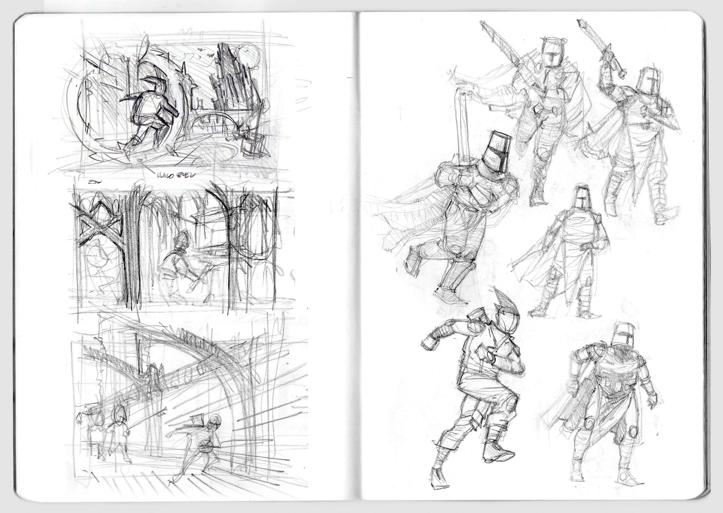
In all cases, I do sketching facial expressions and clothes separately, and then once I’m satisfied I merge everything together and I test postures and colors.
As a graphic artist specialized in architectural rendering and the visualization of the architectural design process, how did you get so good at creating comic book art?
I've loved comics since I was a kid, and I started to draw and to copy comics at the same time. In middle school I used to play RPG, but spent most of my time drawing other player’s characters, and then in high school I did "fanzine" comics with friends.
During my architecture studies, where I started learning perspective more seriously, I did comic-style renders for my projects (which wasn't always the taste of my teachers). Then came 3D, digital painting, and -- like many artists -- the Internet brought me tons of content about drawing and creating comics (I remember some great Gnomon training for figure drawing and comics illustration).
Over the years I've had the opportunity to do professional illustrations in comics style from character design for games (it was a long time ago) to movie poster (more recently). So, in a way I’ve never stopped practicing but, in my opinion, I didn’t push it far enough particularly because Architecture and post-Archviz activities, slowly took up most of my time.
Having said that, there is a strong link between comics and architecture. I think that in the comics that heavily influenced me, the city is, in a certain way, both the subject and the environment, the footprint and the matrix of the action, which take place here; it's a distinct, full character. I have more examples, but if I had to quote some of those it would be Frank Miller and the Gotham of his Dark Knight Return, Katsuhiro Otomo and the Neo Tokyo of Akira (the manga version) and Enki Bilal with his vision of Paris, London, Berlin, and Equator-city in the Nikopol trilogy.
If comics are among the mediums where urban and architecture visionaries can experiment with such efficiency, transporting us into their universe, it is because they depict the living spaces of its characters, which I find somehow difficult to do in a single illustration.
What are your future artistic ambitions?
As I mentioned, I’m so far from feeling fulfilled with my work that my first ambition is to keep practicing. It's a good thing that I have a few KB3D kits I haven’t explored yet!
As exciting as it is, archviz is very time consuming and it is a very compulsory expression where it’s difficult to get off the beaten track. So, being able to find the time to do personal works and exploring comic universes is really refreshing and inspiring. Therefore, I thank you again for giving me the opportunity to illustrate your story.
---

Graduate architect, Jean-Marc EMY is a graphic artist specialized in architectural rendering and the visualization of the architectural design process. He was a finalist in our Utopia #kb3dcontest and also teaches at the Bordeaux School of Architecture in the field of Art and Techniques of Representation. He created all of these incredible illustrations using Victorian, Edo Japan, Gothic and Utopia.