
Droquis has been part of our community from the beginning: he was the first basher to ever post #kitbash3d with our Gothic Kit! He joined our team as Head of 3D back in 2018 and last year he decided to move on to new adventures and focus on his personal projects. Droquis remains a huge part of the KB3D community, so it was a no-brainer to ask him if he would create the cover art for our newest kit, HEAVY METAL!!! We were lucky - he said yes!
Droquis, we know that you generally start your personal work with a sketch, did this one start out the same way?
This one actually started in 3d! I love thumbnailing ideas out in 2d before getting to work in 3d. Although I did use a bunch of paintovers in developing this image, this being a kit cover, I thought it should be shaped around showing off the buildings in the kit, so I wanted to make sure the core of the concept came from the kit itself. I didn’t have any specific idea of what I wanted this cover to be before starting, so I hopped into 3d and while I was setting the kit up for my workflow, I used that time to also get acquainted with the kit and start generating ideas for what the cover could be.
What specific steps do you take with a new kit to get it ready for how you like to work?
Honestly, not much. :) I generally work in FStorm, so the first steps for me are always relinking the textures with Colin Senner’s super time-saver Relink Bitmaps (https://www.colinsenner.com/relink-bitmaps/) and then converting all the shaders with FStorm’s built-in tools. From there, I drop the Heavy Metal kit into a blank scene that already has some basic lighting and atmosphere set up to check everything out.

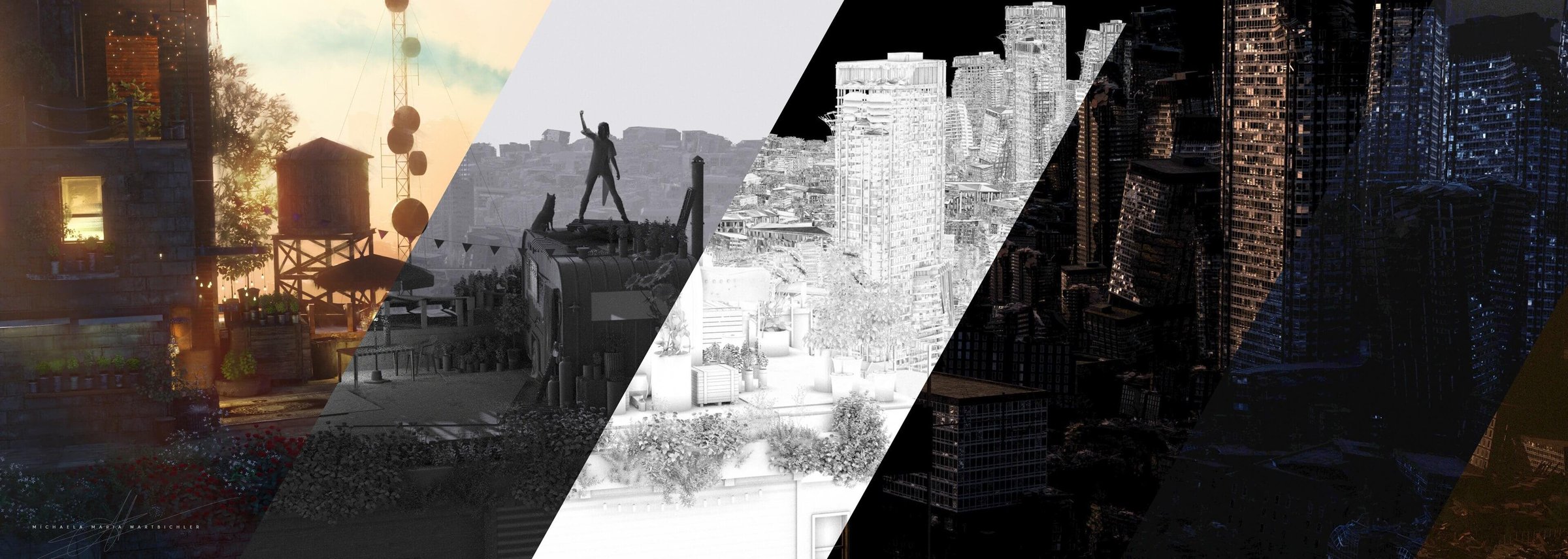
With a rendered window fired up, I then start to pan and look around the kit. Right out of the box, these kits look amazing, so I don’t generally change much, but I think to be a successful 3d artist, one of the keys is making sure you are staying efficient. So as I’m looking through and familiarizing myself with the kit, I’m also making small tweaks to materials to suit my personal taste and style. Doing this once on the kit as a whole means that every time I want to use the kit in the future, I don’t need to redo any of that work. For this kit, all I did was add some procedural dirt and some randomly generated color variation to give just a bit more weathering and realism to the kit. Small discrepancies from converting to FStorm, I also take care of here, tweaking reflectance values, and the strength of the normal maps. These adjustments generally only take me a few minutes, but I don’t want to waste time in the future redoing something I’ve done in the past. You can see the before and after below.

So, with the kit ready to roll, how’d this cover come to be?
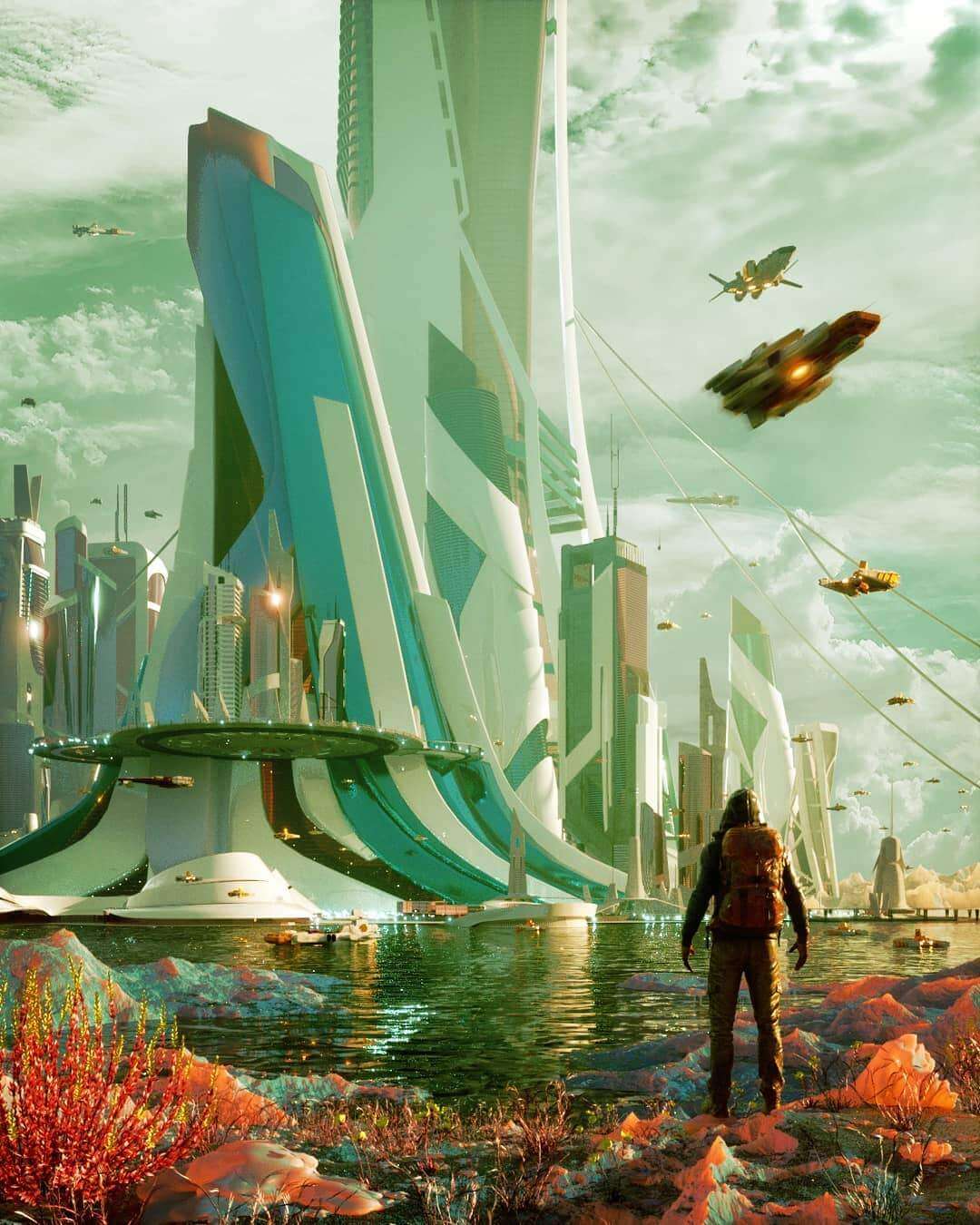
While panning around the kit, I kept coming back to this model:

I love the sweeping lines of the ‘hull’. It also brought to mind one of my favorite artists, Ian McQue and his beautiful floating ships. His worlds always felt like a beautiful and lighthearted take on a rusted, ramshackle, but altogether happy and pleasant place. So when I stumbled on this perspective, those associations popped into my mind, and I decided to run with them.
 I quickly grabbed a couple of buildings that I thought could form the heart of the composition and arranged them into a rough idea, so that I could paint over actual geometry from the kit.
 I find that I think differently about composition when I’m sketching in 2d than when I’m moving things around in 3d. So quick, 5-minute paintovers like these I find incredibly valuable, especially when working on the overall composition. Again, however, because I wanted to make sure that I was showing off as much of the kit as possible, I jumped back into 3d to see how this translated to the actual models I was working with.
 Shifting a couple of buildings around, I realized the last compositional sketch wasn’t going to show as much of the kit as I wanted. Rather than try and juggle 30 buildings in 3d, while tweaking and adjusting the composition, I jumped back into 2d to try and figure out a compositional structure that let me feature more of the kit.
 At this point, I felt like I had a pretty good grasp of the relative size and shapes of buildings I was working with, so rather than painting over the last rendering, I switched to small and simple thumbnails. This is generally where I start my personal work, as it’s an exercise of placing objects within the frame. I think the sketch that I settled on maintained what I really liked about the original idea while leaving more room to build out the world that I was starting to imagine.
 At this point, I was still imagining the center of this image to be a body of water, with the foreground on one bank and the midground across on the other. Thinking back on this stage of the process now, I don’t think I was bothered by the water, but rather that I didn’t have any rationale for placing and organizing the buildings in the distance. One of the unexpected challenges with this image was including a majority of the kit’s buildings in a single image. There are so many crazy, cool forms in here, that when placed next to each other, they all compete for attention, and I already had my two ‘star’ buildings for this composition, so I had to be a bit more tactical in arranging the distant bank. And so, once again, back to 2d.
 In thinking about the organization of this city, it dawned on me that a society with these floating airships wouldn’t have all of its industry-based around water like our world; it would be based around some sort of dry-docking station for them. This, in turn, would give more narrative to the image and give me a way to organize the distant bank. One of the things that I love about 2d is that you can quickly try out ideas that would take a while to test in 3d. A couple of scribbles later, and this looked like it could solve the compositional problem of having too many buildings competing with each other, and it gave me a very clear direction of what needed to be done in 3d.
 With the sketch as a guide, it was quick and easy to take a couple of buildings and bash them into the giant walls that define the void of the docking station. Though I still had the rest of the city and background to figure out, it was at this point that the image felt like it was finally coming together. I experimented with a few different HDRI’s from Peter Guthrie (https://www.pg-skies.net/) to set a general tone for the lighting and mood of this image, and then hopped back into 2d one last time to figure out the overall shape for the background and confirm the lighting and color direction. Surprise, right?
 Nothing too mindblowing here. I figured out a shape that I liked for the background, that I think reinforced the main story and elements of the image and confirmed that I’d be able to achieve the look and feel that I wanted from the lighting set-up in 3d.
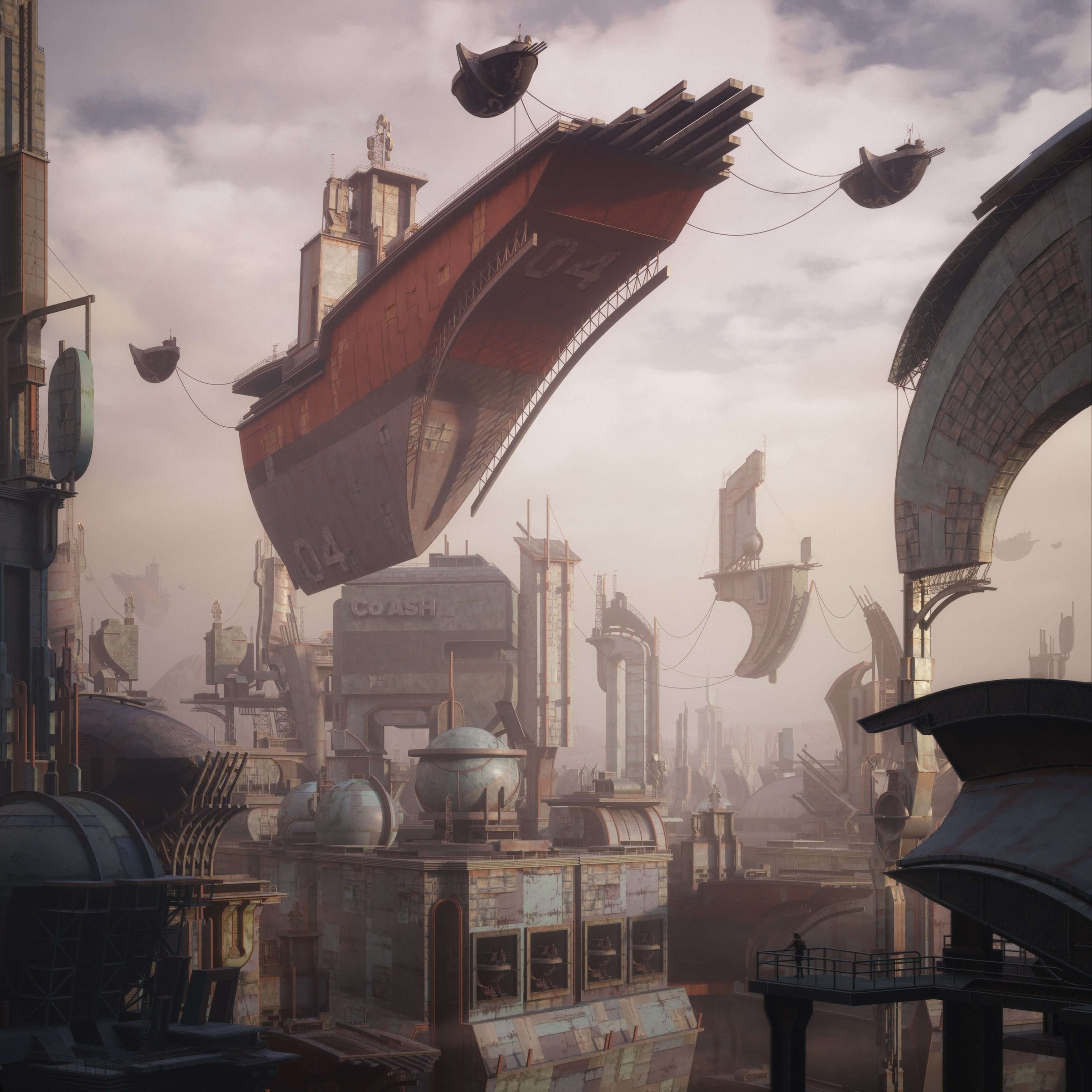
 With that final paintover as a guide, placing some terrain into the background and the remaining buildings of the city was quick and straightforward. From downloading the kit, through developing and refining the idea, and up until hitting render took a little over ten hours for this image. All that was left was some quick photoshop.
 Along with the beauty pass, I rendered out a simple multi-matte, a normals pass, a depth pass, a material, and an object pass.
 Photoshop was relatively straightforward. The materiality and forms of this kit have a weathered, industrial feel to them, as though everything has been repaired or built with spare materials found lying around. I wanted the overall tone of the image to contrast this by being quite soft and warm. This image went through more iterations than most of my personal work, and I think as a result I had a clearer vision for what this world and its people would be like. The buildings were rusty; anything that was new had broken and been fixed long ago. Nothing was shiny or new. Yet, the people were happy. And I wish I could go and visit. I hope that comes through!
Tell us about these Wartime Optimism live streams.
A couple of days into the lockdown and social distancing orders here in the U.S., I decided that I'd spend an hour every day talking about art and how I work, hopefully giving my fellow artists out there a little positive distraction from everything going on in the world, and giving away a few tips and tricks along the way. So every day, I try to work on and talk about something art-related. Kitbash3d kits, and how I use them, are heavily featured, and I've been dying to make some more images with Heavy Metal since I started working on the cover, so I'm very excited this kit is finally out in the open. I think we can expect to see it featured on the Livestream soon. If you'd like to come around and say hello, you can find me at www.youtube.com/droquis, every day at 1 pm EST, at least until we all get through this. And we're gonna get through this.
---

Mike is the man behind the visualization studio, Three Marks. He also masquerades under the alias @droquis on Instagram. Mike was the Head of 3D for KitBash3d and an art director of CGI for DBOX, and is known in the industry for his exceptionally composed, photorealistic 3D architectural scenes. His background includes philosophy, architecture — and smoky scotch.
To see more of Droquis work make sure to check out his Instagram and Artstation