What's the idea behind this image?
I’ve had the general idea for this image since we first started working on this kit, as can be seen in these two early test renders during production.


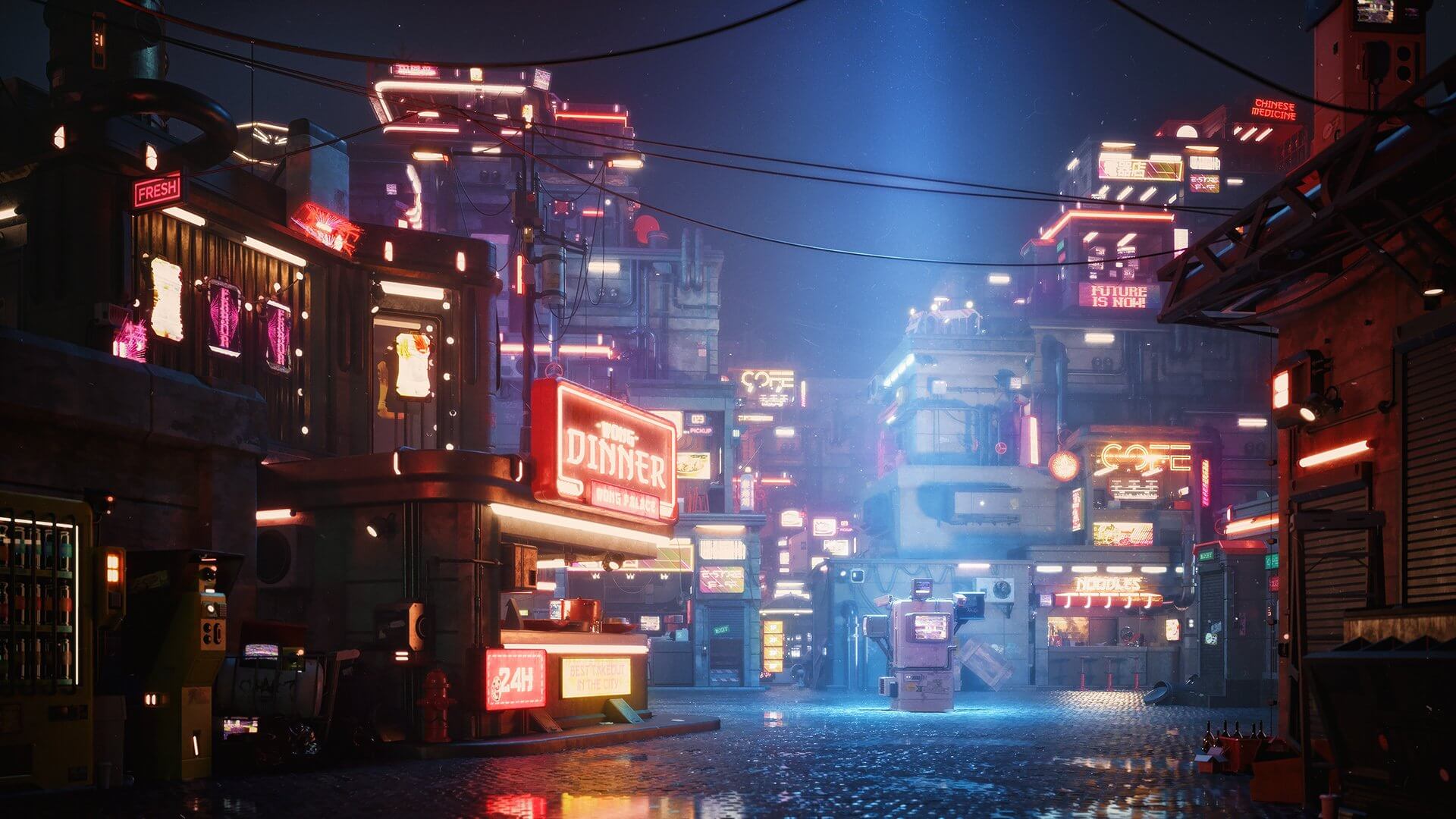
Whereas most of the images I make start with a general emotion that I am attempting to evince, this image really stems from all the details and character that Jian Zhi (concept artist) and Sebastian Bielecki (modeler) brought to this kit. I really wanted to craft an environment whose character and persona grew from all of its details; something like the way medieval cities grew organically on top of themselves, only in a sci-fi setting befitting this 3d kit. Spotlighting one piece of surveillance tech, almost as the main character of the image, wasn’t something that I originally envisioned, but I think it speaks volumes about the city portrayed. I think it’s fascinating how much the physical traits of a city and its architecture can communicate about the people who live there. In the end (I hope) this image suggests a future society that is somewhat ungoverned and lawless on a micro / personal level, but is always aware of big brother watching from above.
Alright, how'd you do it?
As previously mentioned, I had a pretty good idea of the direction that I wanted this image to go in, and I had already made two quick test renders that sort of point to that idea. So the first step was to lock down some notion of the final composition. And if you were wondering just how rough can a thumbnail be and still be useful, see below. :)


While less than an inch in size, and about as simple and as messy as possible, these little thumbnails help a ton to start realistically thinking about blocking, camera height, lens length, etc. If nothing else, they give me something to immediately start working towards in 3d, rather than panning about the models and moving things back and forth.
In 3d, I generally work as quickly and loosely as I can to get to the point when I can hit render and see where I am at. Again, the sooner you can get something to react to, the better. In this case, a few minutes into setting things up in 3d, I realized my idea of having the streetlight as the main focus of the image wasn’t working.

But something about the composition and the isolation in that test render made me think about having the surveillance box all alone in the center of crossroads, with a spotlight from above highlighting it. Not sure where that idea came from, but it felt right, and I ran with it.

At that point it was just a matter of filling out the image and adding some additional details. All told, from putting pen to paper up through pressing render for the final was about an hour and a half. It’s worth noting, I think, that those awful sketches at the beginning of the process make this sort of efficiency possible. By having an idea of what the end composition is going to look like, you can add details quickly based off of what the camera can actually see, and not waste time building out a full and complete scene.
As this clay render from a bird’s eye view illustrates, all design decisions were based off of how they look from the camera, and no time was spent figuring out details that weren’t visible from that perspective. An object is only floating if it looks like it’s floating. :)

Post-production in photoshop was rather straightforward: simply trying to use color and contrast to both bring the scene to life, and to reinforce the driving concept of the image. For any personal work, I don’t worry too much about .psd organization, or being able to change things later; I simply adjust things (frequently destructively) as I notice them, with the goal of constantly moving towards a final image that feels right without second guessing decisions already made.


When did you first venture down the artist path?
In any meaningful sense beyond “I liked to paint and draw as a child,” I’d have to say about 10 years ago. Right about the time I was entering graduate school for architecture I was realizing that I didn’t particularly enjoy designing architecture, but loved bringing it to life through imagery. I finished my degree, but spent the majority of my efforts on the representation of architecture. From there, I dove headlong into Architectural Visualization, working first for DBOX, then Thomas Juul-Hansen, and finally opening Three Marks. For the first handful of years, most of my time was spent learning the craft.
Arch viz is somewhat unique within the CG industries in that there isn’t much specialization; you have to wear a lot of hats, as most projects are begun, executed, and completed by the same person or small team. I was fortunate to have a good number of mentors in the various aspects of the craft and business, and bosses that allowed me to explore my own methods and interests. When I started @droquis a little over two years ago, I did so anonymously, and while I was well-established as a professional by that point, it marked the point that I stopped focusing as much on the craft of making an image and started focusing on bending those skills for my own expression. The first Kitmas Bash brought an end to any sort of anonymity for droquis, but also led to my current role within KitBash3d, which I suspect is a rather strong endorsement for why everyone should be doing personal work.
What is your process before starting a project? What are your research methods? Or do you jump straight into sketching? Do you sketch at all?
Most of my “projects” posted through droquis, are nothing more than one night exercises in creating or expressing an idea. So there’s typically not any meaningful preparation. I’ll have an idea for a scene, or an emotion that I am trying to evoke, and I’ll pour a whisky and get to work. I occasionally look at photo reference, particularly for lighting, but this is usually after I’ve hit a snag, rather than before getting started. I do usually start with a sketch, sometimes in photoshop, sometimes just pen and paper, and to be honest, calling them a sketch is fairly generous. While I would love to have more facility in sketching / digital painting, I haven’t found the time to actually develop those skills.
Instead, sketching for me is to merely take the idea or composition that I have in my head, and start working them out in 2d. No matter how clear the image that I have in my head may seem, the mind has a way of cheating the rules of perspective and the rigidity of a 2d projection. Even though it’s always been right there in front of us to witness, the concept of perspective wasn’t even figured out until the Renaissance, well after humans had started making art. And this, to me, suggests just how much the mind informs and alters our perception of the world around us. So quick sketches, no matter how rough, provide concrete feedback in developing a composition which evokes the as-yet formless idea swimming around in my mind. Once I have something that feels right in that simplified form, I move into 3d, knowing that I have an actual target to aim at and develop.
Why do you make art?
What a seemingly obvious and yet difficult question. The simplest answer, I suppose, would be that I make art because I can’t imagine not making art. The longer answer would be that making art is both therapy and relaxation. Some people (I’m told) like to go for a run when they are stressed or frustrated. I’d bet those same people like to start off a lazy, free Saturday by a quick little jaunt around the park. Some things will forever be a mystery to me. For my part, I can’t imagine a day so bad that making a sketch couldn’t redeem it, nor a day so good that a little sketch wouldn’t improve it.
---
Mike Golden is Head of 3d at Kitbash3d, Founder of Three Marks and parades under the alias droquis all over Instagram.


