Creating with the New Storefronts Kit
This week we debuted our new Storefronts asset kit, bringing you a huge supply of restaurants, showrooms, banks, grocers, boutiques, theaters, museums, and more to personalize your 3D cities and towns. There’s a lot you can do with Storefronts, so to break it all down, we got the perfect person: Darren Butler.
CHECK OUT THE NEW WORLD KIT HERE
KitBash3D: For those who are new here, today we’re joined by our Head of 3D, Darren Butler! If his name isn’t familiar, you may recognize some of the titles he’s worked on such as Terminator: Dark Fate, Destiny, Halo, The Force Unleashed, Knights of the Old Republic, and Love, Death & Robots. We could go on, but there’s a new kit to dive into! So, Darren, since you’d know better than anyone, how did the Storefronts kit come to be?
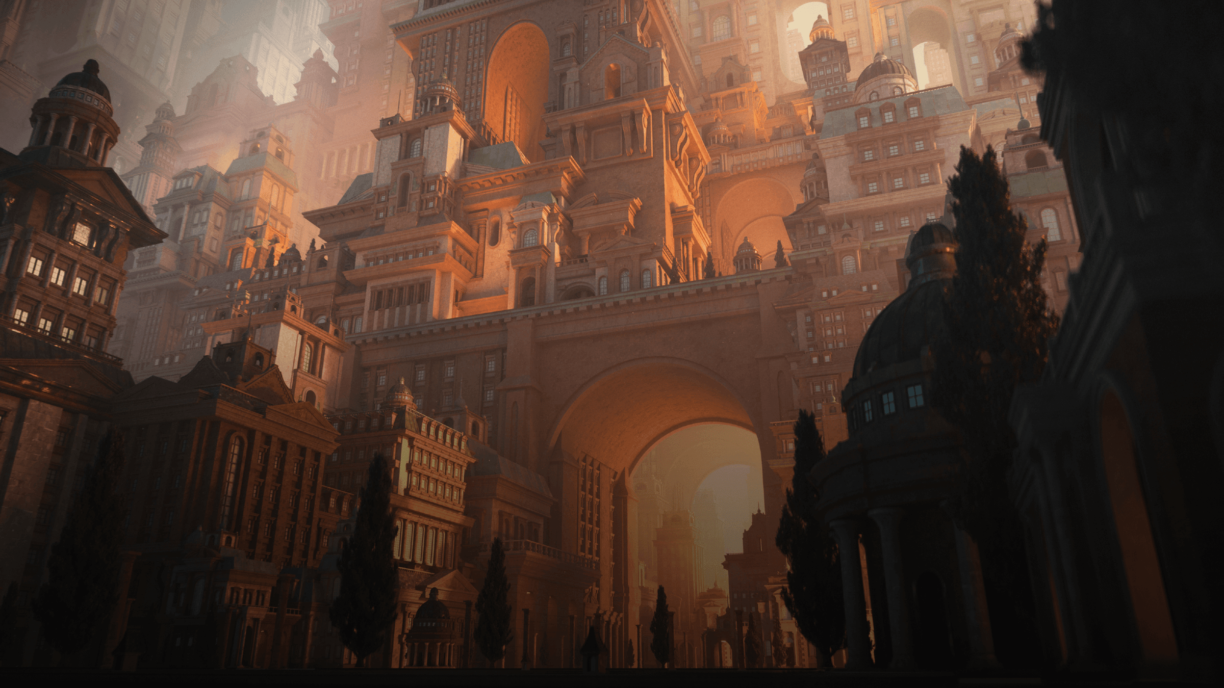
Darren: For so many of our kits, we do them simply because we think they're COOL! We’re always on the lookout for something that inspires artists to create beautiful and unseen worlds. However, this Storefronts kit seemed to be born out of necessity. We have a ton of world kits with towering skyscrapers high above the ground level, but now that we have moved into game engines, we felt we needed more robust assets to enjoy at eye level. On that note, we set out to make this kit as modular as possible so you can easily snap them together and build a lower level foundation for any of our large skyscraper buildings. They're all the same height, so no reworking or modeling is needed!
We also figured Storefronts could be a great kit for the ArchVis community. Back when I worked in ArchVis, I can’t tell you how many generic stores I made to fill in a shopping mall, or any other type of shopping complex. This kit would have shaved off days of modeling!

KitBash3D: It definitely looks like you incorporated the stackability feature into your cover design. How was that? Was there anything else you wanted to make sure to include in the scene?
Darren: This kit was such a fun one to work with. I was first inspired (and challenged) by the wide variety of the kit. Initially we debated, “do we go really high end with the kit like a Louis Vuitton® store or do we go dark and grimy like an abandoned boarded up liquor store?” Meh, we did both! (AND everything in between!) But for this specific image, I wanted to go back to my ArchVis roots and make a shopping mall type of scene utilizing the high and middle end stores. I figured that direction would let me show off as many of the kit components as possible. Literally within a few minutes I was able to create a massive layout and then just zoom around the scene looking for the perfect angle. I’m quite happy with the way it came out. I hope all my ArchVis friends think I “still got it”!
KitBash3D: It came out great! Did you face any major challenges during the creative process?
Darren: The real challenge was the lighting. I kicked around a few versions of day time lighting schemes and even from all kinds of angles. I tried everyone's favorite “sunset /golden hour” lighting, but it felt forced and generic. As I started going later and later in the day (in terms of lighting) I decided to add some interior lights and then BAM! It immediately started to make the stores pop! Now your eye was led straight into the windows, peering in at the details. It really made for a great mood.

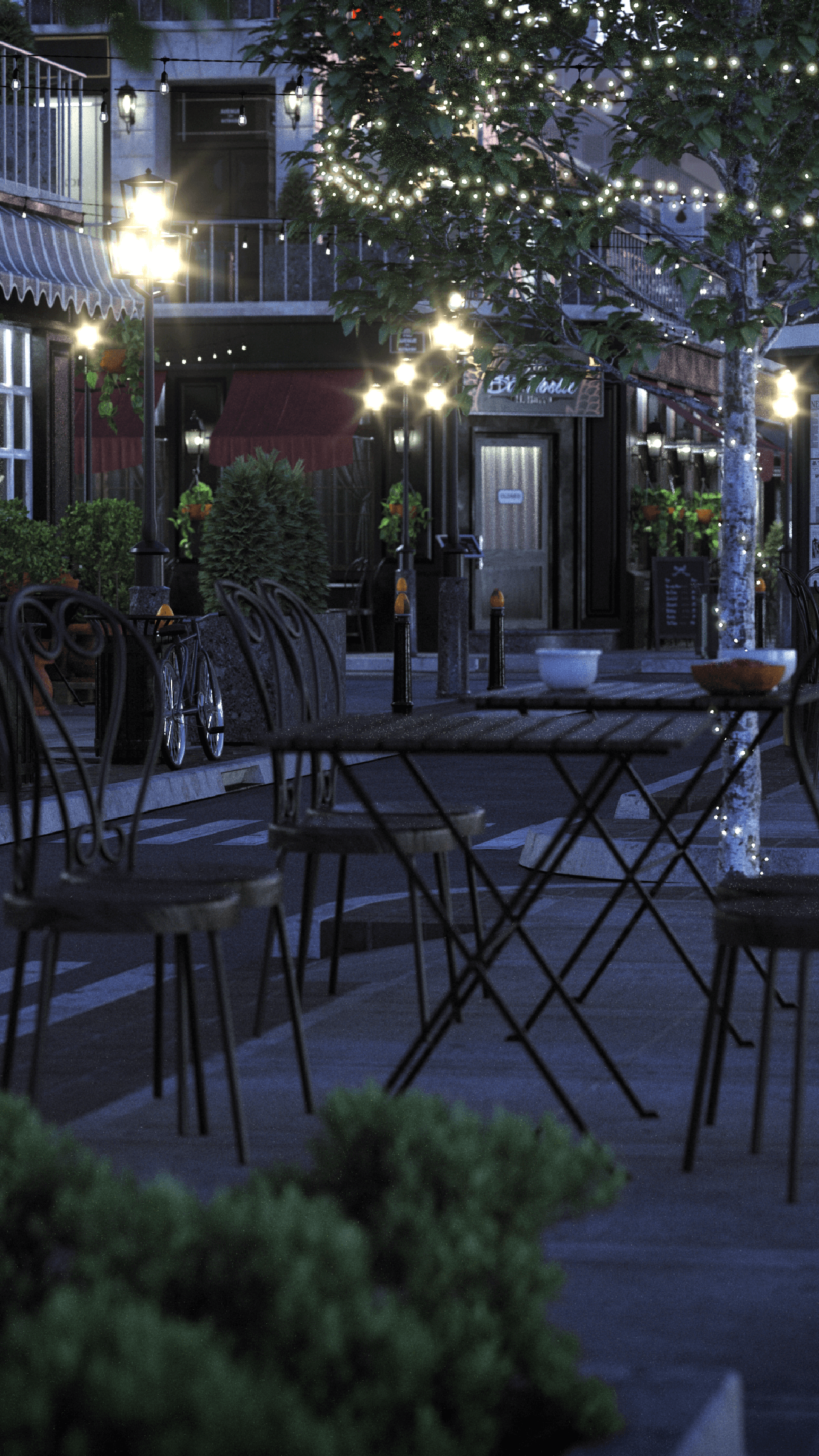
I played around with making twinkling lights in the trees and stringing them across the streets too, but in the end, it just started to get too busy and distracting. Thankfully, I rendered everything on separate layers, so I could easily turn things on and off in the composition to quickly get a feel for what was and wasn’t working.

KitBash3D: I’m sure many people can relate. Practicality aside, what would you say is your favorite part of the kit?
Darren: Hard to say my favorite part of the kit. There are just so many ways you can use it. Outside of the cover, I hope to do another scene featuring the more “low end” elements of the kit: the seedy pawn shop, the boarded up liquor store, the scaffolding around the Super Plus Outlet, etc. I feel like that would be a really fun direction to build out next! Don’t get me wrong, that was one of my ideas initially, but when it comes to cover art we typically like to show off the kit in a light and fun manner, not necessarily something out of a Steven King novel – but there is plenty of opportunity for that!

KitBash3D: We’re running out of time here, but speaking of other uses for the kit, is there anything else you’re looking forward to seeing made with Storefronts? Or any other parting remarks you may have?
Darren: I just really hope my ArchVis friends don't eat me alive! (shout out to Focus360!!!) But in all seriousness, I can’t wait to see what others make with this kit. So many ways to use this in high end ArchVis. Endless ways to use it in concepts. How many times have we seen a generic city outside the windows of a moving car in a movie or tv show? And I personally really hope to see someone in UE4 or Unity running around with a player character. Hell, let's blow em all up in Houdini!?!
Or, if you want a really wildcard idea, with the pandemic still in effect, so many people are shopping online, right? Clothing, food orders... why not make an online VIRTUAL mall/shopping experience?! Walk down the virtual food court and order a pie for delivery from “Fabio’s Pizza”!? Anyone?
About Darren Butler
![]()
Darren Butler served as CG Supervisor at Blur Studio for over 12 years and worked on over 50 projects ranging from TV to Film to Game Cinematics on titles such as Terminator: Dark Fate, Destiny, Halo, The Division: Take Back NY Trailer, The Force Unleashed, Knights of the Old Republic, and Love, Death & Robots with Netflix. You can follow him on Instagram and ArtStation.


