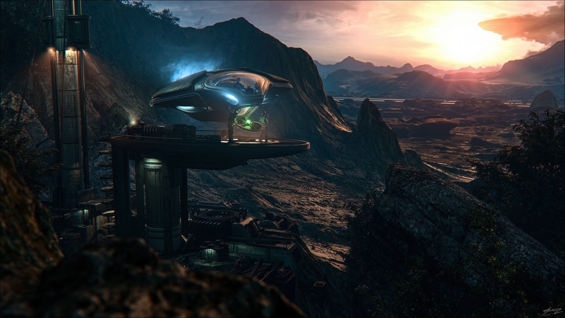
This month, The Last of Us Part II finally debuted to eagerly awaiting fans and did not disappoint: the game has been breaking all sorts of sales records since its release on June 19th and has received quite a bit of critical acclaim. We were lucky enough to chat with one of our favorite concept artists, Danar Worya, who has been working on the game over the past three years with Naughty Dog and One Pixel Brush. Read on to see his exclusive art using the Warzone kit for the game, his behind the scenes processes, and more!

Danar, you must be excited to share your work with the world after all this time! How does it feel to be finally releasing this artwork?
Hi there! Danar Worya here, concept artist working in the entertainment industry based in Rotterdam, Netherlands and founder of Danar Worya Art. Today, I want to take a moment to share and celebrate all the lucky stars, sweat, and tears that went into the release of The Last Of Us Part II and my role in it. I have worked on this project for over three years in collaboration with Naughty Dog and One Pixel Brush. The initiation, planning, and execution of the images I worked on changed my practice for the better forever. Discipline, time management, and internalizing the vision were key. Internalizing the vision of a great team of artists and visionaries changed how I look at the world of The Last of Us.
Part 2 of the game does an incredible job of uniquely blending cinematic storytelling, character development, and realism together. From an environment development perspective, I want to share my behind the scenes approach, challenges, details, and themes that helped foster this unique blend and allowed me to create these images. The red thread that ties all these images together is the design with intent approach. We made sure that every element of the images helped flesh out the story and every object within each frame helped the overall set design and composition in the most realistic way possible, so that players get absorbed into this deracinated, yet vividly somber world.
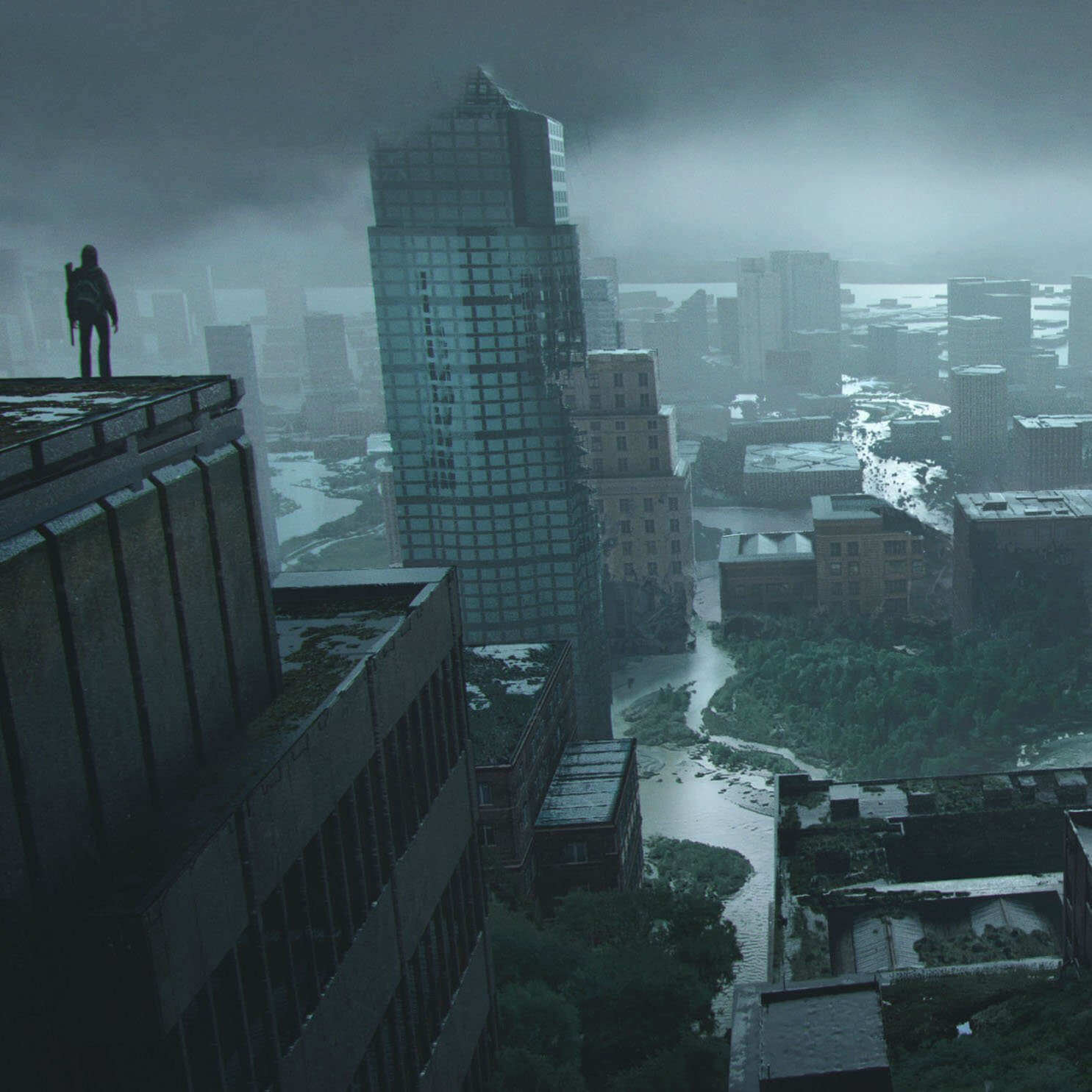
Danar, the shot you created using the Warzone kit titled "Seattle North" is absolutely breathtaking. What's the story behind this composition? How was it working with KitBash3D assets and how did it help you tell The Last of Us story?
The briefing was an overview shot of Seattle, and as people from Seattle would know the weather there is very somber and moody, so my first task was: what is the mood and what do I want to tell within this mood? So I picked a composition for the image which shows the depth of the city itself and at the same time, shows a glimpse of what Seattle would look like after many years of decay.
 The first thing I usually do for a shot like this is gather information, reference, and 3d models online to benefit my needs within making the image. Sometimes for these images, I make a 3d render which is the clean version and put on some decay and weather later in photoshop. This time I thought that I would make a version of my render where the buildings were intact, and one where I had a render of the broken buildings from the Warzone Kit, which I could later implement into the image and get the results I wanted to achieve.
  It was a challenging task to make a vista and show destruction on that scale, so rather than looking for that perfect photo that doesn't exist, I took the Warzone kit and advanced my image way further.
Here I am showing how I approached combining the kitbash elements with my own. Just with a little trick of darken modes in photoshop, you can get pretty far. And the small example I show here is the whole process of how I approached making broken-down buildings.
1. I start with the original render, and next to that 2 render passes. The first one is the original and the second one the KitBash Warzone set. Now we are going to mix them both. 
2. After I make all the render passes. I select the Warzone "Clown Pass", which is the one that shows the destruction. After selecting this, I mask out the parts that are broken.
  3. After I cut out the initial broken forms it's time to add the destruction on the inner parts of the building. There are many ways to approach this, but one way I like to use is copying the broken elements from the KB3D render and putting it on top of the first render and putting it on "Blending Mode" to darken. What this does is show only the dark elements of the layer you put on.
Normal Layer:

Darken Layer:

Combined Layers:
Glad to see Warzone came in handy! Can you walk us through more of your concepts for the game and share any other workflows you think are important here.
One approach is to make most of the images based on real locations; the tweaks are minimal. For instance, the Sniperstreet image is based on the Google Maps photos of the street. I looked at the photos and envisioned a layer of The Last Of Us destruction that would complete it. The challenge in layering this specifically for this image was the fact that I had to show that someone was sniping there. However, the bridge was rather far away. For this reason, I could not show a character. This is where my inner gamer came alive and I recalled the Battlefield sniper zoom-in element, it always showed a small white reflection dot. This dot became the sniper and clarified the vision of the image. But then the question became: "how do you build this?"... and "how do you know where your audience will look?"... and "do they understand what you are trying to do?"
As you can imagine there is no one size fits all here. It all depends on the artist’s take. The visionaries of this project always gave hints on what was going on but they never used me for my drawing hand only. That’s why it becomes so essential to challenge myself continuously. It was fully in my hands to honor the overall vision.
This process often happened with Shaddy Safadi, founder of One Pixel Brush. He would get me the brief, share his input, and say, "If you can pitch a better idea than I have, always do that, but if it's not better than what we envisioned here you have to go back". This would always trigger and challenge my creativity to bring on what I had to say to the table; it was about going the extra mile. That extra mile included thorough desktop researches for the smallest details about all elements in the frame to be as realistic as possible.
For instance, let’s take the Depot Entrance and Depot Thick images. For these images I actually drove up to the nearest Ikea I could find, talked to their staff, and upon approval started snapping photos of their isles where you collect the items. After this, I went into 3d and see how far I can take it there.
 As a concept artist of this caliber, I use 3d to maximize the quality and impact of the images at hand. For this, I learned a seemingly small yet highly efficient rule from the grandmaster of Naughty Dog concept artist, Eytan Zana. The 20/80 rule. When we are designing the interiors we tend to make 80% of the scene in 3D and after that move to Photoshop for the remaining 20%. However, when it comes to organic imagery like vistas or outside locations where it is lush and greenery I apply 20% 3d and 80% photos or painting. This reasoning stems from the fact that hard surface things are more eligible to be captured in 3d, so you don’t have to worry about the perspective. The calculation of 3d software will always help out in interior cases regarding light fall.
Overall, the idea of working in 3d is you have a base which tells you the space and the perspective of objects within the space, and how the lighting should fall on the story element YOU want to tell. After this, I always went into the photoshop for color grading reference and put it all together. I know you are reading this and thinking oh it is all smooth sails but that is not the case. Along the way, I hit some rough waves that you might not notice in these images at first glance.
The main challenge was one question I kept asking myself, how could I build the concept in such way that the 3d artist has a clear view on mood, placement of objects, and role of characters in the frame. Nobody should ever forget that this is full on teamwork. Each element needs to have a purpose for the next step. For this, let’s take the Courthouse Rose window as an example.
For this image the briefing was that the militia people have taken over this area in the game and the questions for the concept art image are: "what do these people do in their free time?".. and "how do they divide the area into sections?"
The first idea that came into mind is was these people might need a good barber there. That became the main point. It may seem simple, but it is a unifying experience. Of course, when one person gets a haircut there are more who want one, but during this time everybody will keep busy, by either playing chess or the guitar. These are all human elements. The key is to not get lost in the grandiose mystery of the world, but to make it relevant and relatable to all. However natural it may seem in our day-to-day lives, the human aspect and experience can be very challenging to integrate.
Even if it is about skeletons, the readability of the clothes, skin, and bones, it all has to be clearly defined without the noise and all possible realistic details. That was one of the specific moments where I identified myself most in relation to this project when we had to design the dead skeletons for our team. I got the task of how to come up with how the civilians died with another colleague Florent Lebrun. We were asked to focus on to get to the nitty-gritty aspects such as how the flesh, bone, and clothes degenerated. When I got the hang of it, it showed me that when I put my mind to it, I could bring that point of view to life.
While bringing the images to life in your execution phase, refrain from solely relying on your 3d base. It is very hard to go overboard with detailing as the image can lose its readability. On enough occasions, I had a detailed 3d base but then a photo still worked better and I used that. You cannot see the effort made in 3d as a waste of time because it still taught you something for the next image. However, getting attached to what you create in the execution phase can be detrimental, you always need to keep your aim with the concept at hand in check.
Regarding this, the last year of the project was the most enjoyable; I had internalized the vision and the feedback rounds decreased from three to maybe one as I became completely aligned with the client. Today seeing it all come to life and being able to share it with you all puts the biggest smile on my face. I am proud to have been part of this artistic journey.
Looking ahead, I still have a lot to learn. For instance, currently I am learning Zbrush, experimenting in some personal work reflecting my love for science fiction, and art directing myself.
Art has formed my way of thinking about life, made me curious about subjects, people, places that I did not have any prior knowledge of before painting. It is very romantic because art always confronts me with the things that I am afraid of and I somehow come stronger out of it every time with deeper perspectives. Last of Us II was a great part of this.
I cannot wait to see and experience what the future holds for me but before that let’s celebrate this milestone, and I hope you enjoy the cinematic concept art images I am sharing today.
---

Danar works with studios such as Naughty Dog, Guerilla Games, Axis Studios, as well as teaches concept art courses in Paris, and gives lectures in Zagreb, Barcelona, and Eindhoven. To see more of his work visit ArtStation or follow his Instagram.