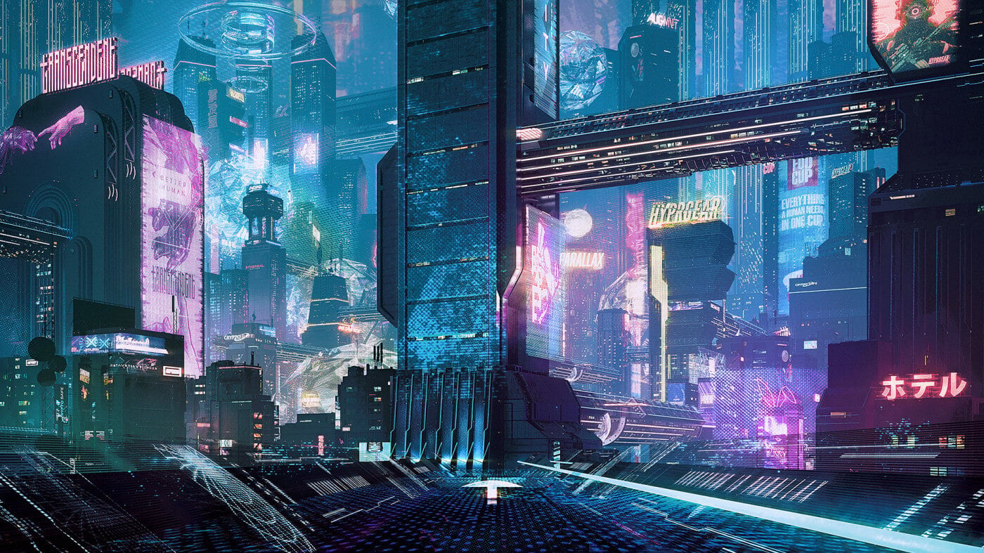
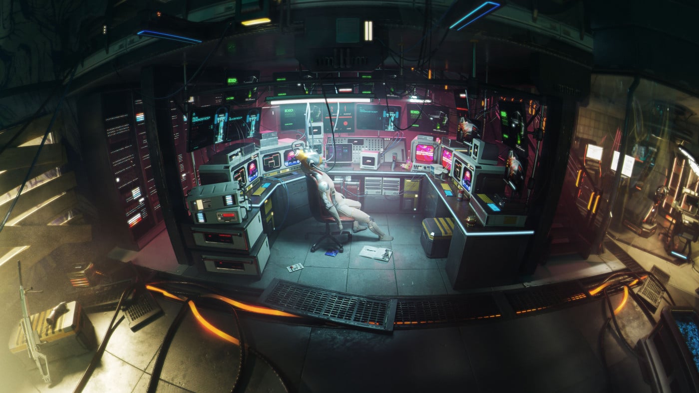
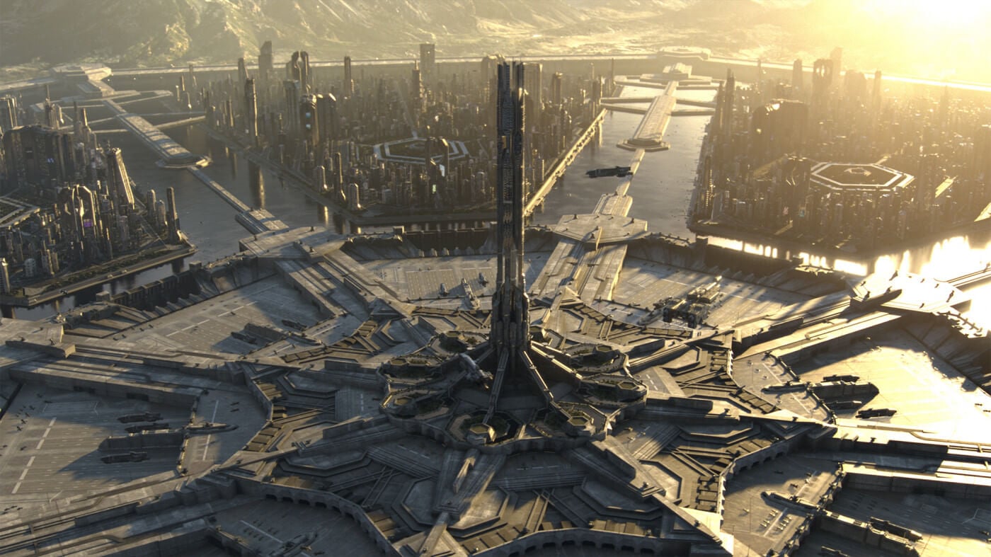
Since it emerged in the 1970s, the “Cyberpunk” science fiction subgenre has popularized many tales of excess set in futuristic dystopias, juxtaposing advanced scientific and technological achievements with elements of societal collapse and decay. It’s a storied aesthetic, and we wanted to get our CyberPunk Kit right so artists everywhere could have the building blocks to make their own additions to the genre. Keep reading below to learn more about all the hard work our team put in to make it happen!
SEE OUR CYBERPUNK 3D ASSET KIT

How did you approach making a cyberpunk-themed Kit?
Maxx Burman, Co-Founder:
Cyberpunk is such a beloved genre, and it was really important to us that we did the theme justice while also adding our own KitBash3D spin on it. We set out to design something that felt unique from other Cyberpunk IPs, and yet felt customizable for creators to use in a variety of ways. It's packed with epic structures, intricate details, and fun storytelling throughout, and I can't wait to see what the people make with it!

Mike Reese, Head of Kits:
One of the story elements that we wanted to make sure we got across with the Kit was the differences in class that can be seen in the various building types. The larger buildings are a bit cleaner in design and in the technology used since there is more money flowing into them by the corporations. On the other hand, the smaller buildings get dirtier as they get smaller, use cheaper tech, and are overall messier given who uses them. Telling those stories was really important to us so we could get that classic cyberpunk feeling while also giving a base for our users to build their own stories and worlds.

What was your favorite part about working on/with the Cyberpunk Kit and why?
Emre Aktuna, Concept Artist:
My favorite part of working on the CyberPunk Kit was the holograms in the concepts that I worked on. Building designs too, but holograms, ads, and all those details add this sense of world building into the environment; they keep things intact, living, and set them into a world that has its own trends.

Emily Amick, Graphic Designer:
CyberPunk was so extremely fun to work on with the team. When I first got my hands on it, I was so inspired by all of the gorgeous work Sebastian and Emre had already done with the models that I tried to put a lot of thought and story behind the branding within the Kit. The goal was to create original brands that would fit in with the societal class structure that we had planned for the buildings themselves. It was amazing to create brands that spoke to the cyberpunk style but also to have those brands interact with one another, giving the Kit a more detailed, realistic feel from a signage standpoint.
One of my favorite parts was creating this overarching AI corporation “Parallax Corp” that essentially controlled all of the businesses inside the world and subsequently the counter culture called the “Zero Society” that still believed in humanity. Seeing all of these designs come together through Alexey’s textures and the 3D signage Sebastian made brought my excitement to a whole other level. There are tons of little things in this Kit that make it unique and truly a KitBash representation of the genre.

Sebastian Bielecki, Models:
My favorite part of working with CyberPunk was unbound freedom. I had basic concepts for all the buildings and structures, but there was a lot that needed to be designed on the fly. I love sci-fi and hard surface modeling so it was perfect for me. I could unleash my creativity and just go with the flow. From the start, I wanted to include 3D signage and neons. It was amazing that Emily, our graphic designer, could jump in and design some cyberpunk brands and logos. I really enjoyed creating them in 3D.

Alexey HrDesign, Textures:
My favorite part of working on CyberPunk, and perhaps the most difficult part, is learning the stylistics and trying to get into the aesthetics of cyberpunk. In the texturing process, I started by working on the color scheme of the buildings and separating them into several cyberpunk-inspired stylizations that fit the geometry of our buildings.
The buildings of cheap residential complexes, eateries, and small industrial buildings I classified as low class with the style of Kitsch (cheap poser). They are mostly concrete and painted walls with fewer technical elements and metal panels. The mid-range buildings I categorized as mid-range, neo-kitsch style, with bright metal panels and more modern finishes. Skyscrapers on the other hand are more militaristic and austere with large metal panels and unusual metal alloys; these are rich companies and corporations.

Mike “Droquis” Golden, Cover Artist:
I mean, what other genre lets you just go absolutely nuts with neon lights? Cyberpunk is always fun to play in, and this Kit has a great range of fine grain detail and huge towers to build a scene with. There is something I find immensely satisfying in trying to build a massive, [hopefully] awe–inspiring landscape out of buildings. The genre also allows for a different sort of freedom in post–production, which allows for a blending of 3D and 2D that is pretty unique, and that I really enjoyed getting to experiment with.

Ready to experiment with our new CyberPunk Kit for yourself? Click here to get started! For further inspiration, our team recommends some of the classics and hidden gems of the cyberpunk genre, including: Blade Runner, Ghost in the Shell, Akira, Johnny Mnemonic, Cyberpunk 2077, Deus Ex, and BLAME! Happy KitBashing!


