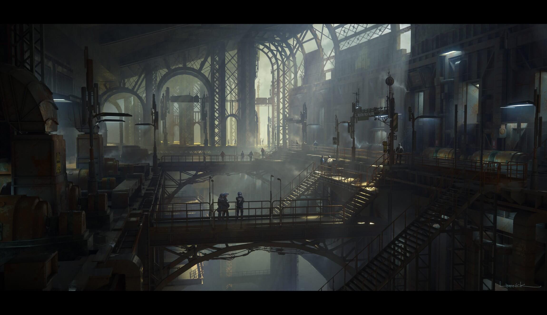
We were incredibly pleased to have Aaron Limonick -- whose 16-year career has led him to work with LEGO, Disney, Rhythm and Hues, Paramount, and 20th Century Fox to name a few -- create the cover art for our most recent Props Kit: Machinery. Aaron is currently working for Sony at Naughty Dog Inc. and has recently worked on The Last of Us and Uncharted 4: A Thief’s End.
We were able to pick his brain a bit and get insights on his process in the following interview:
Before beginning the cover art for Machinery, did you have a storyline you wanted to pursue?
I didn't start with a storyline, but more of a feeling I wanted the world to have. When I initially looked at the kit, I loved how it had this retro-industrial feel to it.

Not to say that the machines aren't current, but it made me think of the industrial revolution. Then I thought it would be really cool if I kept the look of the machinery to be rather familiar, but added scale and grandeur that made it feel more Sci-Fi. I also love to see how I can push the lighting into a slightly fantastical range while keeping it naturalistic overall.


We love the fantastical approach! So how did you actually create the cover art?
In this case, I pieced together large prototypes of the space with a general idea of the composition in my head.
 They were large chunks that I used to fill out the larger shapes of the composition. Then I brought in the smaller elements of the kit to flesh out the details, so to speak.

Once I had the camera where I wanted it, I instanced those large chunks in Octane Render, which uses very little render cost. It also gives me the ability to adjust the composition and lights in real-time, which gives me a better idea of how it will look in the end.
When did you first start creating art?
I always wanted to be an artist for as long as I can remember, even though my eventual career as a concept artist was not something I had ever thought about. I always loved designing robots, monsters, and huge environments that looked like side-scrolling 1980s video games of my childhood. Spending almost ten years creating graffiti murals with some of my fellow artists that used aerosol paint, I learned that the collaborative process was one of my favorite things about art.

I eventually studied illustration at ArtCenter here in Los Angeles, and was part of the "guinea pig class" for what would become the Concept Design department. I had my second run with collaborative effort among other artists, and finally realized that working in entertainment was the best career path for me. Fast forward 16 years of working in the entertainment industry, and that brings us to today, where I have spent time working on games, film, tv, architecture, teaching, fashion and illustration.

Do you use 3D the majority of time in your work or do you prefer drawing from beginning to end?
Every five years or so I change my process, but these days I do most of my work in 3d to allow more precise construction and easy exploration. When I move to the 2d painting part of the illustration, all the large elements are rendered out, so I can adjust elements, add details, and bring more life to the piece without wasting time in the "block-in" period of working on a detailed 2d painting. I use many render passes as masks to paint within, which is something we would all have to create manually in the pre-3d days. However, I utilize lots of sketching to design my ideas before building them.
Check out this trailer of Aaron's course he created for The Gnomon Workshop: Environment Design and Illustration, revealing his process using 3D and 2D.
Any dream projects you want to work on or personal projects you want to begin or finish?
My personal work doesn't have a cohesive theme, at least not intentionally, but I notice that many of my personal pieces take on a similar feel as if they were all part of the same universe. So, I plan to eventually release an art book of my work over the last few years.

In addition, I keep a regular traditional sketchbook, of which I plan to compile into several books and release them soon.

Check out Aaron's Learnsquared course: Sketching Anything.
---

Aaron Limonick was born and raised in Los Angeles and has been working as a concept artist in entertainment since 2004. While studying illustration and traditional painting at the Art Center College of Design, he began gravitating towards the collaborative effort that entertainment lends itself to. Through a fellow artist, he got his first job working for Activision at Neversoft Entertainment. After working on several games at Neversoft, including developing the original ip, “GUN", he moved to San Diego and worked at High Moon Studios for over 4 years. Here, he worked on pitch artwork for multiple Vivendi Universal projects, as well as developing "Transformers: War for Cybertron" under Activision. After moving back to LA in 2011, he worked on feature films such as Seventh Son, RIPD, Into the Storm, and Jupiter Ascending, and worked for studios such as LEGO, Disney, Rhythm and Hues, Method Studios, Paramount, 20th Century Fox, and Mirada. Now, Aaron is working for Sony at Naughty Dog Inc. and has recently worked on The Last of Us and Uncharted 4: A Thief’s End.
Make sure to follow Aaron on Instagram and check out his portfolio on ArtStation and his Website.


