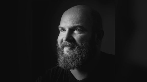
How Mike Golden Makes Photorealistic Scenes
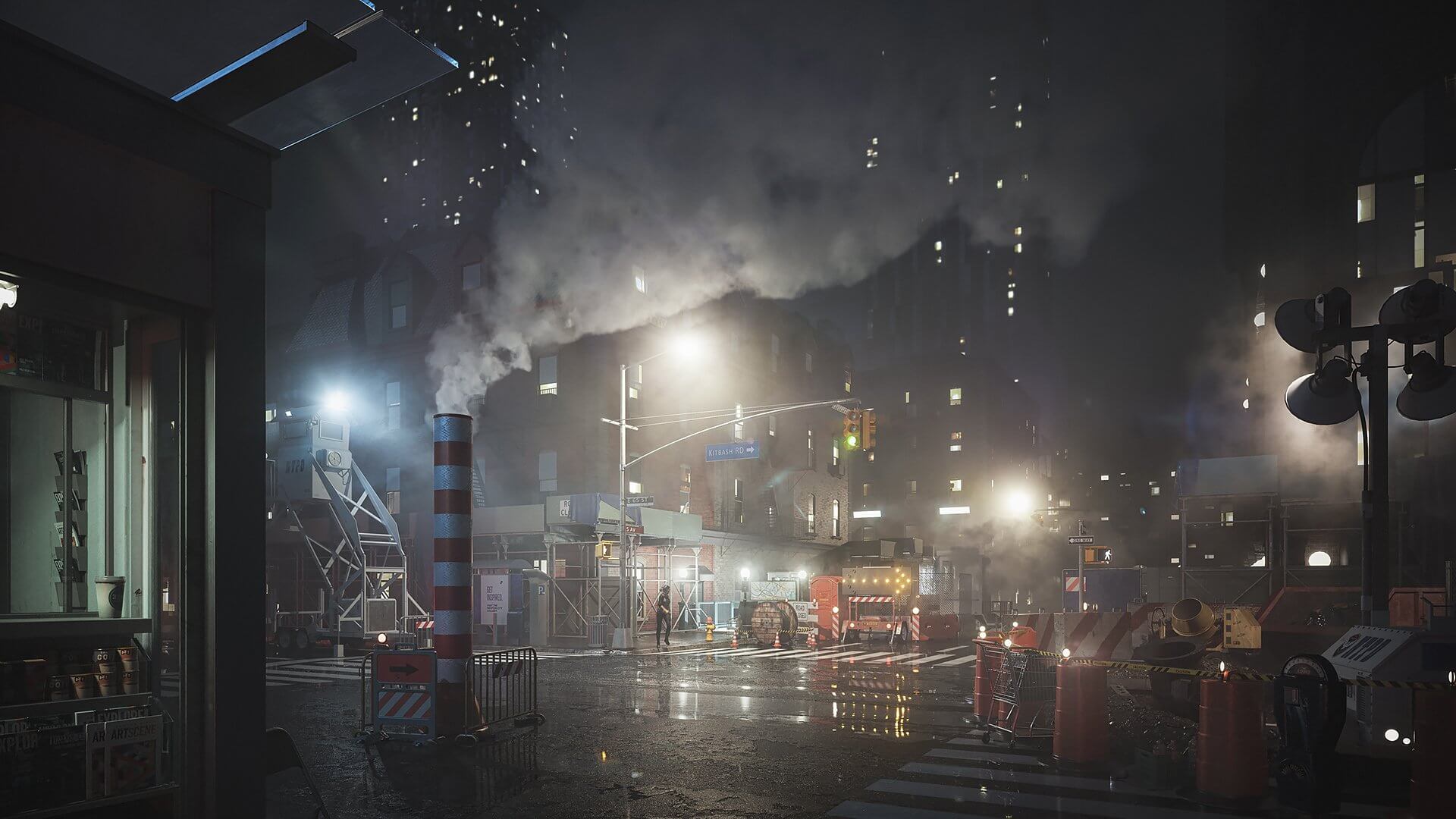
We designed our City Streets 3D asset kit to make bringing “everyday life” to urban backdrops even easier. The kit is chock-full of construction zones, littered sidewalks, bus stops, subway stations, and all sorts of roadside props. It’s a lot to convey in a single cover art, so we asked Mike Golden, AKA Droquis, for help. With his ArchViz background and eagerness to share his process, we knew City Streets was in good hands, and we hope his breakdown below is valuable for your own creative process!

KitBash3D: Mike, thanks so much for joining us today and being a longstanding member of the KitBash3D community. For those who don’t know, Mike Golden, our own former Head of 3D, is the creative genius behind the cover arts for Heavy Metal and Cyber Streets, but obviously there’s much more to him than that. Mike, can you give us an overview of how you got to where you are today?
Mike Golden: Thanks, it’s such a pleasure to make another cover art – and for such a rocking kit! I got into the industry a bit later than most. At the age of 26, after earning a bachelor's degree in philosophy (and putting that degree to good use working on charter fishing boats in Alaska and playing poker in California), I decided to get a master's degree in architecture. That’s when I was first introduced to 3D and rendering, and I quickly realized that I much preferred making images of architecture over designing it.
By the time I graduated, I was applying to ArchViz firms, and I managed to find a home at DBOX in New York, where I worked as an Art Director of CGI for several years before heading out on my own and opening Three Marks.
KitBash3D: Such an interesting background! And awesome that career shift has gone so well. How has this past year treated you?
Mike: On the one hand, I could definitely say it's been tough, as I think it has been for all of us. There have been new challenges both professionally and personally that I don't think any of us expected to have to ever navigate, and I think we all miss seeing our friends, traveling, not having to worry. But on the other hand, it's also been great. My wife and I are on the verge of welcoming a second daughter into our family.
I've been very fortunate that those closest to me have remained healthy through all of this, and work, though affected by the pandemic, has remained constant. I've also taken the extra time at home as an opportunity to pursue more personal work and creative practice. When the initial lockdowns began and we thought this would only last a couple of weeks, I decided that I'd try and share a little artistic positivity with daily live streams. After about 80 of those, I had to knock it back to just Mondays and Fridays, but over a year later they are still going strong with a great group of artists that I can now call friends coming by to hang out and make art with me twice a week!
I've also (finally!!!) managed to cement a daily practice routine into my day, and I have to admit, the effects of that have been rippling out in ways that I couldn't have possibly imagined. So, it's been a tough year, yes. But for the parts of it that were within my control, I feel like it's been a banner year.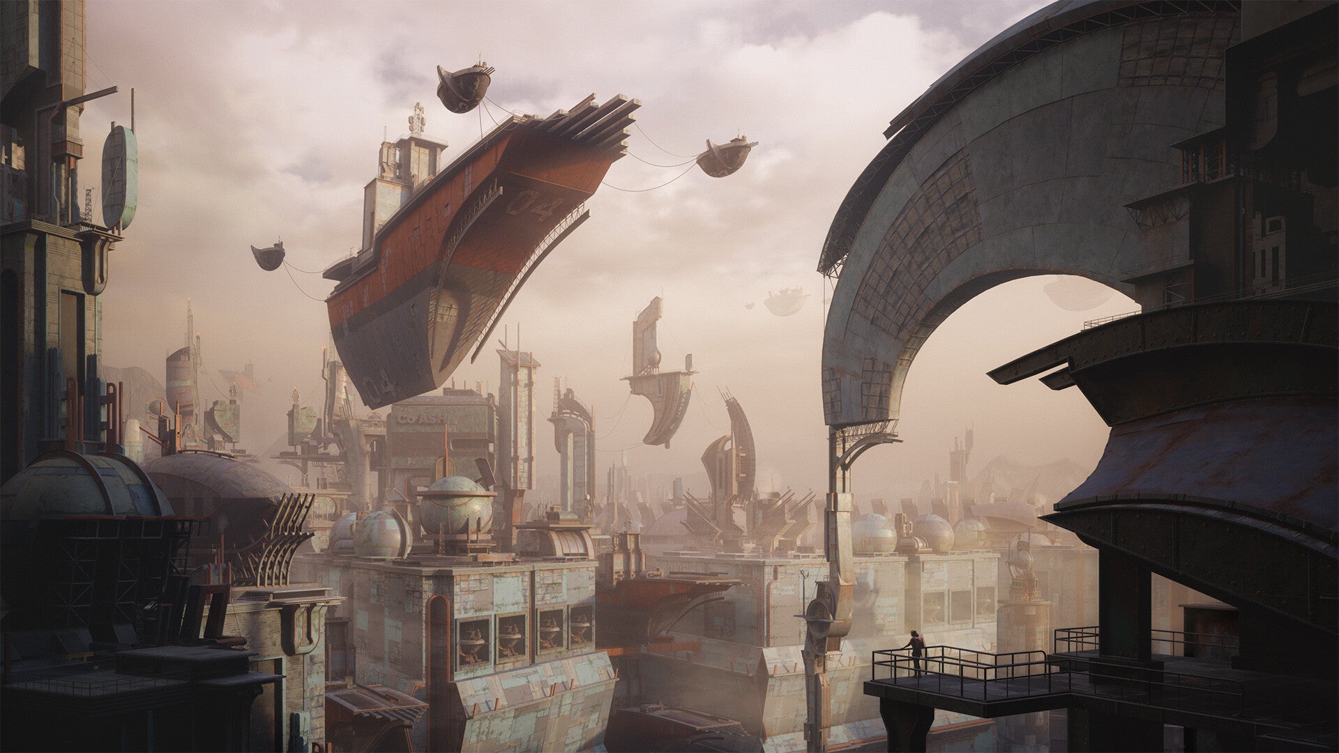
KitBash3D: That’s great news, very happy to hear it – and congratulations especially for the child on the way! As far as the daily practice goes, what ways has that improved your approach for City Streets as compared to the cover arts you’ve done in the past?
Mike: Hmm, that's a strangely difficult question to answer. In its broadest strokes, my process hasn't changed much. I still generally start with an idea or emotion that I want to convey. There's usually a simple 2D sketch to give the initial 3D work some direction. And then from there, it's a mix of developing the scene in 3D and using 2D to refine the idea until it feels complete. That much hasn't changed drastically, but as I'd guess is probably plainly evident from the personal work on my instagram account or from my livestreams, I'm constantly experimenting with that process.
Every project or image is a little bit different, and I think it's crucial that we remain flexible in adapting to the task at hand. For instance, an image meant to show off a kit of kickass 3D models need to be approached a bit differently than an image meant to show off a single building, which in turn needs to be approached a bit differently from an image meant to give the sense of a new world. Particularly in our professional work, I find it's really easy to slip into a tried and true routine. That's not necessarily a bad thing - deadlines need to be met, certain levels of quality need to be attained. The result, I find, is that there is typically only a small amount of experimentation and risk that we can introduce to any given project.
Experimenting and getting out of our comfort zone is where we learn the most, that's where personal work and practice come in for me. It's a place where you can try new things, switch up the process, test new methods. Some of it works, some of it doesn't; some of it you can introduce in one way or another to your professional workflows. It's all adding tools to the workbench so that, should you need them in future projects, they are there and ready.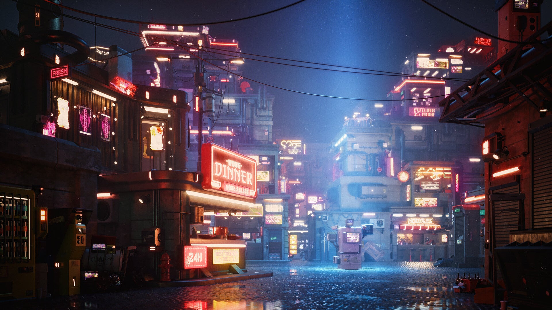
KitBash3D: Going back to “starting with an idea or emotion,” what was that for your City Streets cover?
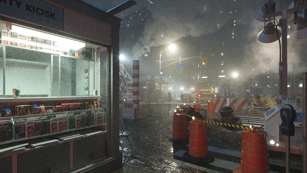
Mike: When I started the cover, the main thing that I wanted to accomplish was to show all the evidence of a busy and lived-in city without relying on crowds of people to do so. This being the City Streets kit, I wanted the assets to tell the story.
I think it’s a recurring fascination for me, how the built environment, whether realistic or fantastic, can say so much about the people that live there. As an aside, there was a really interesting study where college students had to give personality assessments of their friends and also of strangers who they’ve never met but who’s dorm rooms they got to see. It turned out their assessments of strangers were much more accurate than those of their friends.
Anyway, back to this image, I've been really into Nicolas Miller's gorgeous neo-noir New York City photography (@nickmillers), and I knew that I wanted to do a dense night scene with a lot of atmosphere. It wasn't until I was posing the sole character in the scene that I came up with the idea of having her running and looking back over her shoulder as though someone was following her out of the subway. I like that it's a bit ambiguous; is she the heroine, trying to get away? Or, the bad guy, trying not to get caught? Overall, I hope that it implies more than it tells and leaves you wanting to know more.
KitBash3D: Well, if I had to do a personality assessment of you and your render I would say you have a great appreciation for detail and your studio must be impeccable. Can you walk us through the work-in-progress images you shared with us to give a better idea of your thought process?
Mike: When I sat down to make this cover I had just finished making all of the product shots for the kit, so I was already super familiar with all the different assets I had to choose from. I had a rough idea in my head of what I thought I wanted to make but I still took just a couple of minutes to doodle out a sketch to start placing things in 2D.
I probably could have started this one straight in 3D, and with the overarching goal being to show off as much of the kit as possible, I knew that anything I drew was likely to change once I started working with the actual assets. But I still like the process of starting with a sketch, even if I don't stick to it. I find it easier to organize my thoughts and I find that it prevents the endless panning and rotating that we can fall into in 3D. Plus, I've been dabbling with more pen and ink type of stuff in my practice lately, so I wanted to at least start there.
With that starting point, and knowing that it was going to be a challenge to incorporate a lot of these assets into a single scene, I hopped into 3D, and immediately laid out the sketch and hit render with the lighting that I had been using for the product shots.
At this point, just a few minutes in, it was easy to see that the composition was going to need some tweaking. But as much as camera placement, lens choice, and object placement affect composition, I think lighting plays an equally important role. Lighting obviously goes a long way to determining the feel, mood, and atmosphere of an image, but it also controls the contrast and visual organization of a scene, so I wanted to get at least the rough look that I had in my mind into the frame buffer.

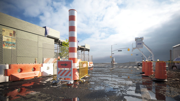
And then of course, if it was going to be a city scene, it needed some city buildings. The Brooklyn kit felt like it fit the bill here, so I quickly dropped in a few of those buildings.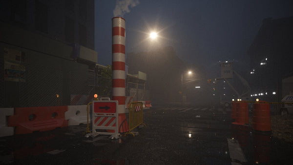
Now it was time to sort out the composition. I started moving cameras around the scene, not worrying about fixing details or tweaking anything, just seeing if I could find a view that would lend itself to showing off the kit. I still had the same general idea for the image in my mind, and I had an idea of what assets I wanted to add into the scene with enough context to evaluate how much space and prominence they would take once placed, so I set out moving and testing cameras while imagining what they would look like fully populated.
As a general rule in 3D, I find that the more work and time I spend setting something up, the less inclined I am going to be to change that later on, even if it would benefit the image as a whole... a sort of cg inertia. So, my goal is always to get the overall composition and feeling of an image sorted out before I start refining details and building out a scene.

When I got to the last image in that sequence, I felt like I was on to something. I liked how the crosswalk gave the image a lot of structure, leading the eye into the image, and I felt like it was organized in a way that the kit would sit into the scene nicely. So I quickly grabbed a few of those assets to see how they looked.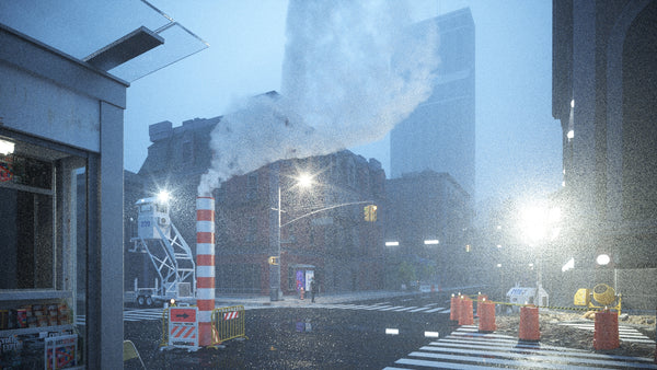
This felt right. For the first time I could start to see the finished image, it was just a matter of building out the rest of the scene, refining the lighting, and tweaking details. My first thought was to go real dark and moody with it (surprise, surprise).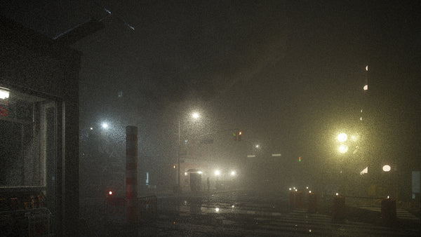
I loved this direction, and if this kit was called City Fog, I probably would have pursued it. :) So I started backing off the fog a bit...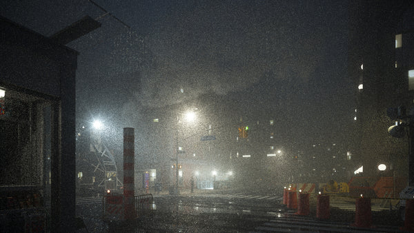
And then added some ambient fill lights...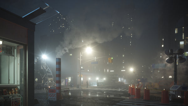
All while continuing to add and refine details within the scene...
At this point, I was feeling pretty good about where the scene was at. There were still a few details that needed to be added, and of course, post-production, but there was also the issue of aspect ratio.
As with all the KitBash3D covers, we would need a landscape version, a square version, and a portrait version. While I've often been happy with square crops that I can pull out of landscape or portrait images, getting all three usually means compromising at least one of them. And I'm not a huge fan of compromise, haha. So just as with the Heavy Metal cover, I decided to make two separate versions, one landscape and one portrait.
For the portrait version, I simply moved in the construction area and tweaked a few other objects to better suit the new camera. Rather than copying objects and using separate layers, I typically use just some super simple auto keyframing when I'm arranging things, so that a simple slide on the timeline morphs the scene between the two setups. I rather liked how claustrophobic this started to feel in portrait, and it's here where I decided that rather than having the character just standing in a sort of Gregory Crewdson manner, that she should be running and looking over her shoulder. I did a quick test to see if something a bit more crowded worked in landscape.
And didn't like it one bit. :) So sliding back to frame 0,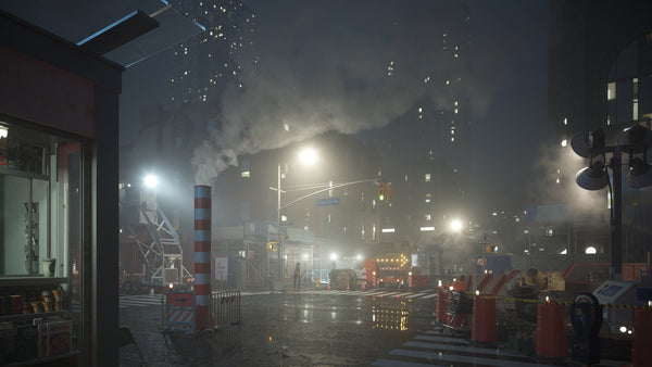
And with that we were off to post-production. I repeated more or less the same steps for each aspect ratio, starting out with a few render passes: lighting, emission, reflection, multimattes, and my beloved zDepth. I use these typically to create masks for targeted adjustments.

From there, it was really just a matter of adjusting some colors, controlling value to give the image depth and control the focal points, doing some painting to refine the fog and atmosphere, and of course (for a scene like this) adding a few lens flares.
Post-production is one of my favorite parts of the whole process. As such, I tend to approach it differently for every image. Because I rarely have to pass off my Photoshop files, I tend to work in a linear, often destructive, and always messy fashion. My goal at any given point in the process is to fix whatever is standing out in need of attention the most. That way I’m always fixing the most important thing at any given time and when I get to a point when I'm zoomed way in or making minuscule tweaks, I know I'm done. Along with a whole slew of curves and hue/saturation adjustments, I used a few plugins: Nik Color Efex for a few global adjustments, Boris FX Optics for lens flares, and Exposure X5 for the final grade.
Since the beginning of my career, post-production has been one of my favorite parts of the cg process. While there are plenty of tips and tricks and technical skills to learn, that side of things tend to be pretty easily acquired. What's taken me a lot longer, and what I find infinitely more interesting, is learning what you need to change not how to change it.
There are a million ways in Photoshop to make something brighter or darker, and fundamentally, that's really all that you are doing, but by making something brighter or darker, you are either making it more prominent or less prominent in the image, either pulling it forward in the image or pushing it back.
Most changes individually are rather minor, but at the end, to me at least, the difference is vastly more significant than the sum of the parts. If you're interested in learning more about my thinking and process in post-production I'd encourage you to stop by one of my weekly livestreams on Twitch where I have a tendency to go on about such things at length. Sometimes ad nauseam. :)

KitBash3D: Wow! Thank you for the detailed breakdown. I know you're going to have your hands full soon welcoming another family member in the coming weeks, so I think we should wrap this up with one last question... Why do you make art and what are you looking forward to in 2021?
Mike: Oh man, so many reasons. I think every time I've been asked this, I've given a different answer. And I don't think it's because it's changed, I think it's usually just the first one that occurs to me. I love that feeling of bringing something to life that didn't exist before I started. I especially love that feeling of making something that I didn't think I could make until I did. I love knowing that no matter how long I get to do this, I'll never have all the answers. But I think more than anything else, on the best of days when everything seems to go right, I'll make an image that expresses a feeling in a way that I couldn't with words. And then, on the best of the best of days, that may come through and resonate with someone who sees it. They may even tell you about it.
I think 2020 has given all of us a lot to look forward to at some point (fingers crossed) in 2021. But more than anything else - outside of family and friends - I'm looking forward to the same thing I was looking forward to in 2020: more of those best days.
KitBash3D: Beautifully said. Thanks again, Mike. We really appreciate you taking the time to create with us and sharing your thoughts, and we wish you many more “best days.”
About Mike Golden
Mike is the man behind the visualization studio, Three Marks. He also masquerades under the alias @droquis around the internet. Mike was the Head of 3D for KitBash3D and Art Director for DBOX and is known in the industry for his exceptionally composed, photorealistic 3D architectural scenes. His background includes philosophy, architecture — and smoky scotch. You can follow his work at Instagram, Twitch, ArtStation, and YouTube.
Artists that inspire Mike include Ian McQue, Alex Vede, Ryan Woodward, Derek Hess, and Marek Badzynski.