[Program Complete] from David Perry on Vimeo.
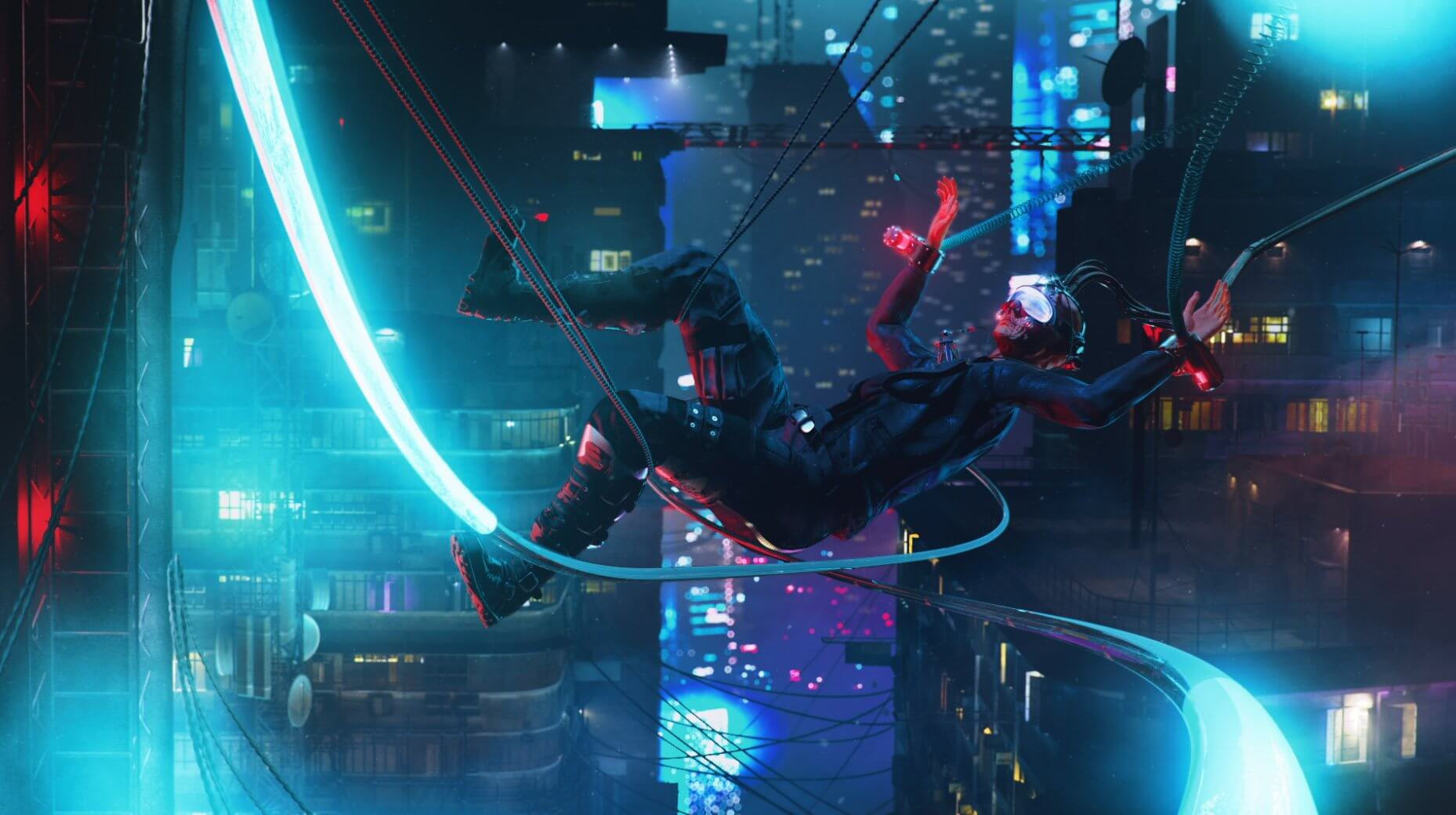
While we gear up for the last month of the POST-APOCALYPSE #KB3DCONTEST before the deadline for entries, we wanted to share with you David Perry, our grand prize winner for the CYBERPUNK #KB3DCONTEST in-motion category, and his vision behind the winning piece. His winning video revealed a bleak future, with no hope or beauty in the world; only a virtual escape. The story focused around leaving behind the world to permanently become one with nature as a new entrepreneurial start-up has developed the latest in medical technology called "Quiet Night".
What were the themes and plot devices behind your video?
I’ve always been interested in the sci-fi/cyberpunk aesthetic, but have never really explored it. I wanted to approach the darker side of cyberpunk from a different angle, darker than your typical flying motorcycle or cybernetic enhancements. I began to think about virtual reality as we know it today and how it’s strictly a visual experience - but what if in the future it’s jacked into your nervous system and can make you feel true emotions and even pain. It would have the potential to be a true escape from a dystopian society, but as with most escapes, the problem would be returning to real life and coming down from that high.
As humanity tends to do, there will be people and corporations coming up with solutions to get you through life in the easiest (and of course most profitable) way possible. In this case a virtual reality euthanasia device for the low, low, price of your remaining life savings. Who is this woman, why does she want to end her life? She’s young in her virtual reality, but old and weathered in reality. Did she live a long happy life or did she spend her life just trying to save up enough money to end it after slaving away for a faceless corporation? Is she sick? Just tired of it all? These are all questions I thought about, both good and bad, and they informed my themes. I thought the juxtaposition of the hero’s final escape surrounded by beauty transitioning into the dark overbearing reality of the city as her life fades away could be an interesting visual that tells a short, but intriguing cyberpunk story.
Emotionally, I think it could be interpreted in a variety of ways depending on the viewer's beliefs and interpretation - it’s a dark future and of course a very dark subject matter, but at the same time our hero is going out on her own terms in a way that brings her peace and happiness. I think in a way it encompasses the cyberpunk aesthetic - although the genre is inherently a vision of a darker future, the inclusion of bright city lights, adoption of technology, and with the will to rise up against the ruling corpocracy and take matters into your own hands you can find happiness and escape within the darkness.
Dark, but also potentially with a silver lining! Alright David, take us through your process.
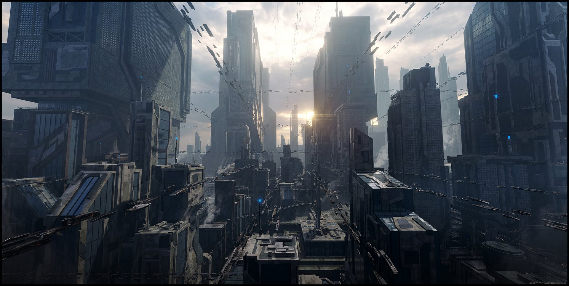
Even though I loved the theme of the contest I didn’t initially plan on entering due to time constraints with work and family commitments. So logically the first step was to get rid of the family! But in all honesty, I have massive respect for all of you talented folks out there that are creating amazing art on a frequent basis and I seriously have no idea how you do it! My son happened to be taking a long nap one day while my wife was at work and I decided “why not?” I usually just have a rough idea in my head and don’t do much in the way of sketching out concepts, especially not in a situation where I wasn’t planning on anything coming of it, but as I got into the zone I realized that while using KitBash3D elements, most of the hard and time-consuming work had already been done. The only problem now was I had a decent looking city, but no story. Over the course of a few days and long commutes to work, I began to develop the story in my head.

I ended up creating the first scene mostly with the landscape generator software Quadspinner Gaea and a few Megascans assets. The foliage was created with Forester. The woman was created and animated with the iClone 7 suite of tools. After all that was done I needed to create a seamless way to get between the two scenes to convey that it wasn’t two different locations at different times, but the perspective-changing between the woman’s point of view and the viewer’s perspective.
Letting her float up a bit in the first scene helped to sell the idea that it wasn’t grounded in reality along with the glitch and also helped to ease the camera rotation into the next scene. I didn’t initially plan on having the glitch effects before the transition, but a little secret here, the glitches are there to cover up some janky animation that I didn’t have time to fix but in the end, as Bob Ross would say, it was a “happy little accident.”

As far as the city build went, I wasn’t quite sure at first how to light it up for a night scene so it required a bit of experimentation. I ended up playing with the textures on the windows a bit and gave them a bit of transparency and roughness and used a few different techniques.


Coming from a more commercial and sports motion graphics background there were definitely some challenging moments just due to familiarity with things. Things light lights and neon’s I pretty much create on a daily basis, but I rarely deal with anything organic and it’s not often I’m dealing with large city scenes, creating a large landscape, foliage, and characters. It was also a huge challenge trying to find a technique to illuminate the windows and I’m sure I still have a lot to learn. The KitBash3d assets made creating the city a breeze and that was definitely the easiest part of the whole animation.

Excellent work, David. Could you tell us a little more about your life and career as an artist?
I guess you could say I’ve been an artist for my whole life, I loved drawing as a kid and just kept doing it. Unfortunately, my drawing skills didn’t keep up with my age, but my drive to create did. I started experimenting with Photoshop and 3D in high school and fell in love and decided to go to school for graphic design.
After 2 years doing graphic design I realized I wanted more and transferred to Savannah College of Art and Design for the Broadcast Design and Motion Graphics program. While there I had some great professors guide me in the right directions and before I knew it they had helped get me a job out in LA. I’ve now been working out here for over 10 years working on great projects and meeting amazingly talented artists and trying to learn as much as possible from everyone I meet!
David Perrys Reel:
And finally, what does art mean to you?
There are whole books written about this and yet I probably still couldn’t give you a full answer for this question. In the most basic way, for me, art is all about communicating a story or idea. It could be the story the artist wants to tell or maybe just how you personally interpret it even if it means something different to you as long as you stop and think about it and feel some sort of emotional connection. I think art has the power to change the world and I know that even in the most dystopian cyberpunk world there will still be people creating art.
David, We can't wait to see what you will make for the POST-APACOLYPSE #KB3DCONTEST!!!
---

David Perry is a designer, animator, and photographer based in Los Angeles, California. He has an awesome wife and dog, and likes video games and travel. Feel free to contact him if you want to learn more!
You can Follow David Perrys projects at his Website, Behance, and Vimeo


